
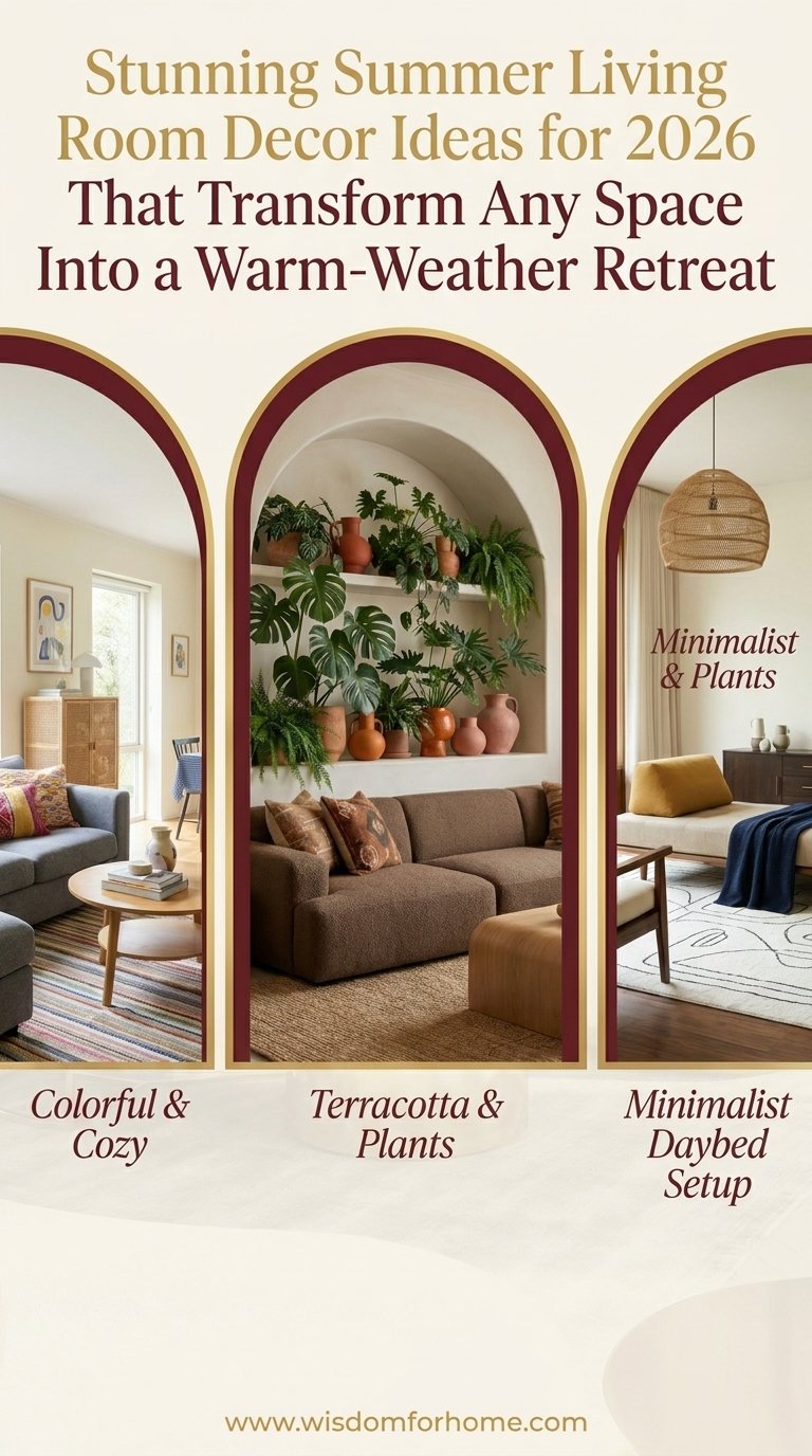
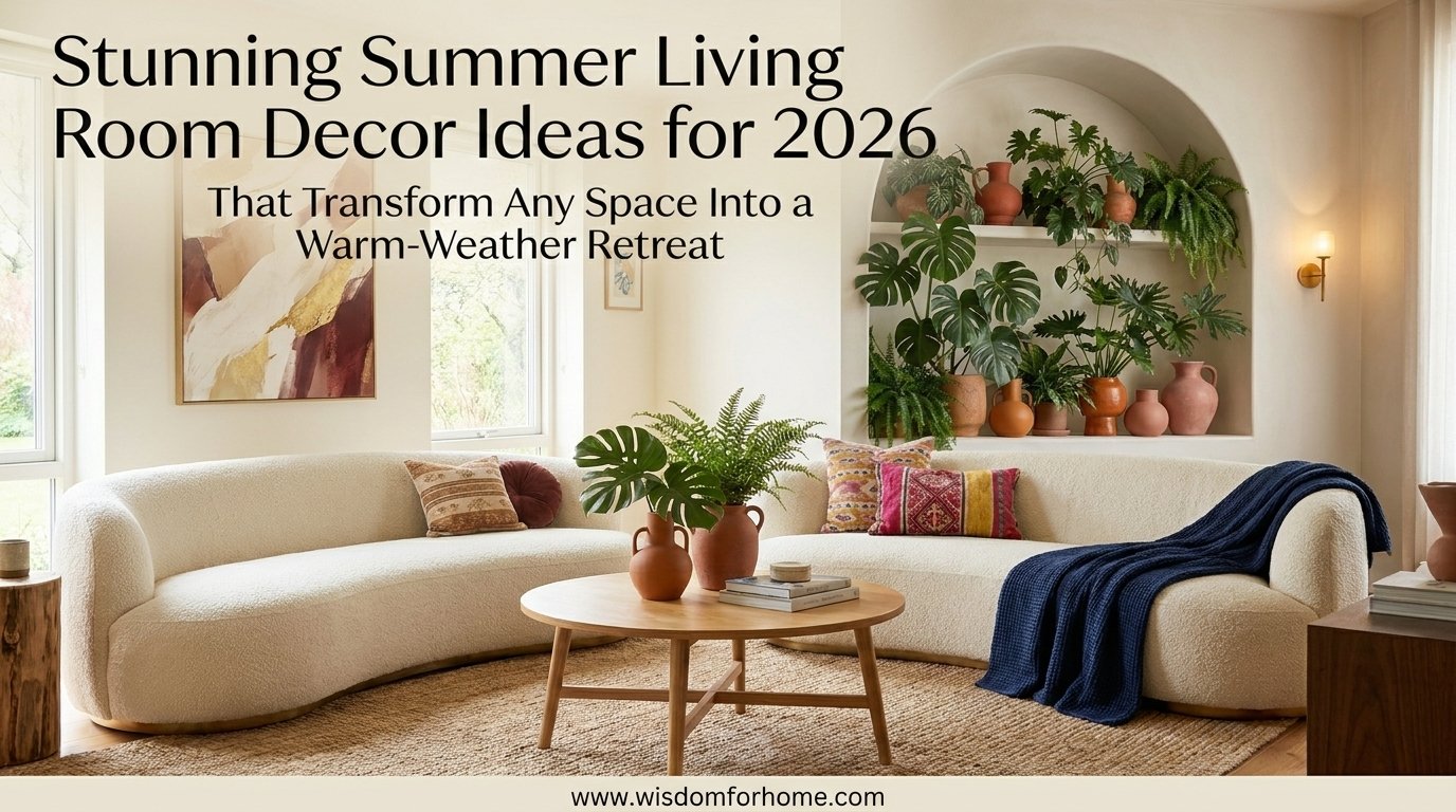
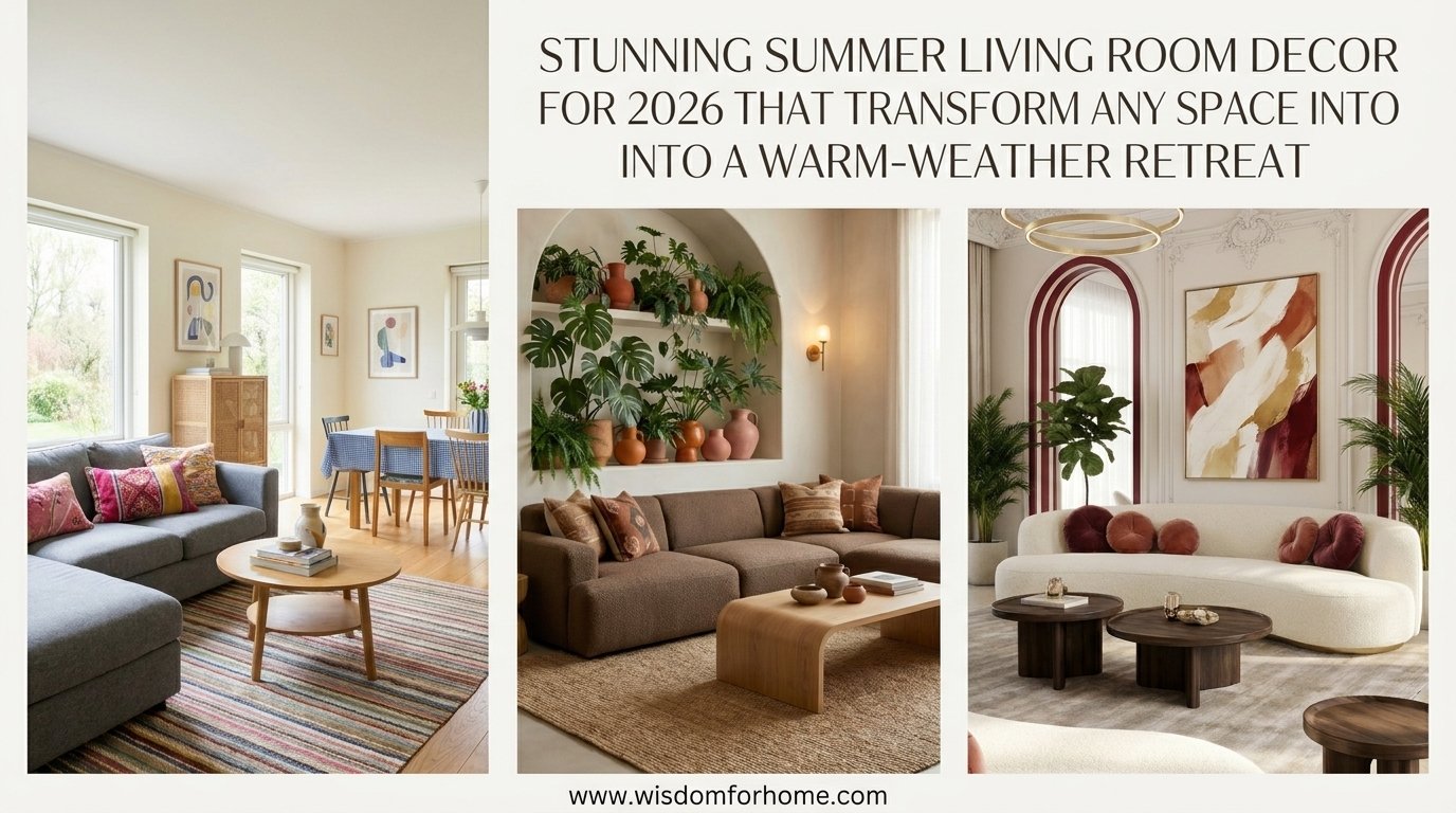
Summer 2026 is rewriting the rules of how a living room should feel. The cold, performative spaces of past years are giving way to rooms that breathe — ones built around warm neutrals, natural textures, and light that moves through the space like heat through linen. Whether your room faces the street or a garden, whether you rent or own, the shift happening right now puts personality back in the driver’s seat.
You want a living room that feels like a proper summer retreat but you’re not sure where to start, how much to spend, or which styles actually work in a real home. This post breaks down 10 specific looks with exactly what makes each one work and how to get there without a full renovation.
Check out our related guide on How to Style a Coffee Table for Every Season.
Key Takeaways
- Natural materials win every time. Rattan, linen, jute, and raw wood are the foundation of every top summer style in 2026.
- Color doesn’t mean bold. Sand, terracotta, dusty blue, sage, and warm cream are the palette of the season — tones that feel personal, not painted.
- Light is the cheapest upgrade. Swapping heavy drapes for sheer panels transforms a room’s entire mood for under $40.
- Texture over quantity. Fewer pieces with stronger shapes and richer surfaces outperform rooms crowded with matching sets.
- Any budget works. Seven of the ten looks below have specific budget-friendly paths, including thrift store and DIY alternatives.
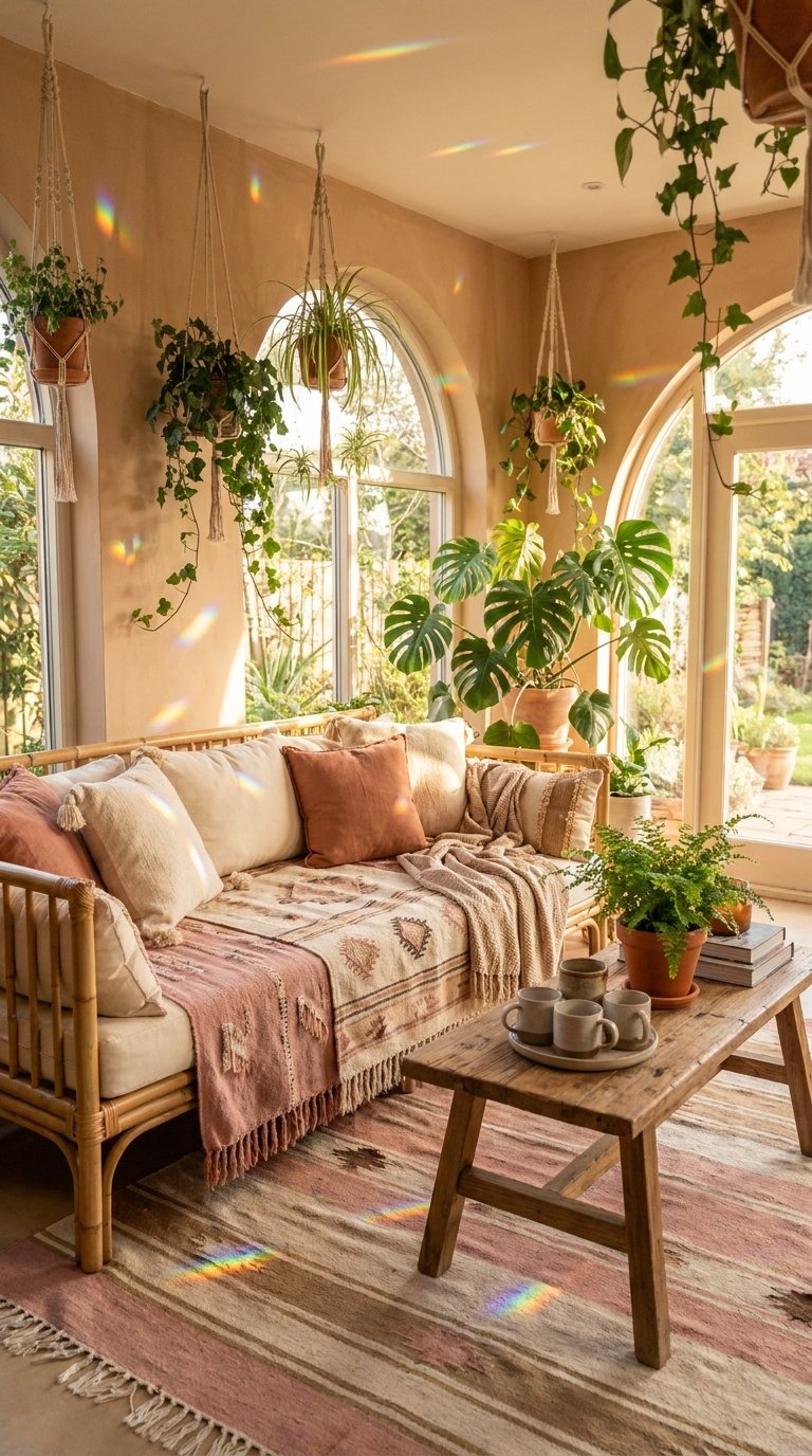
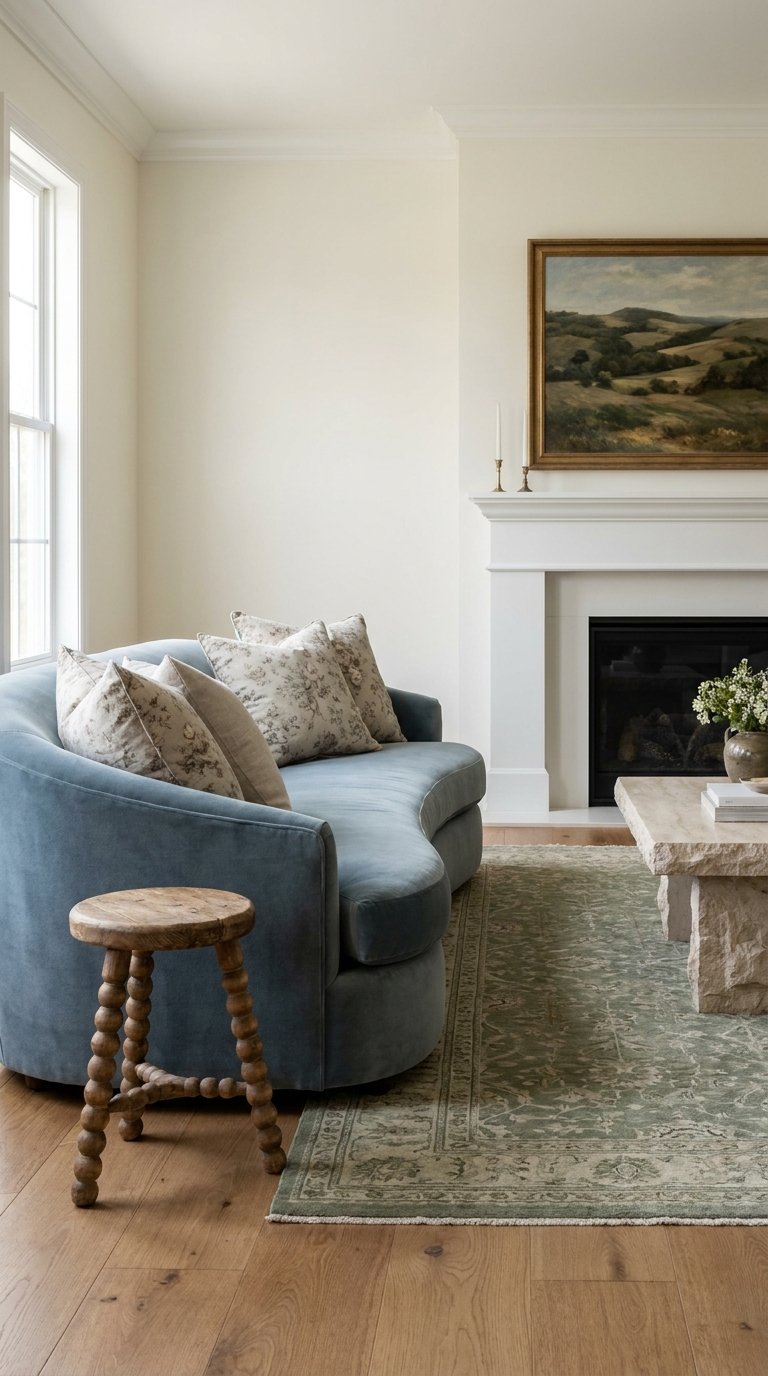
Coastal Light-Filled Living Room Retreat
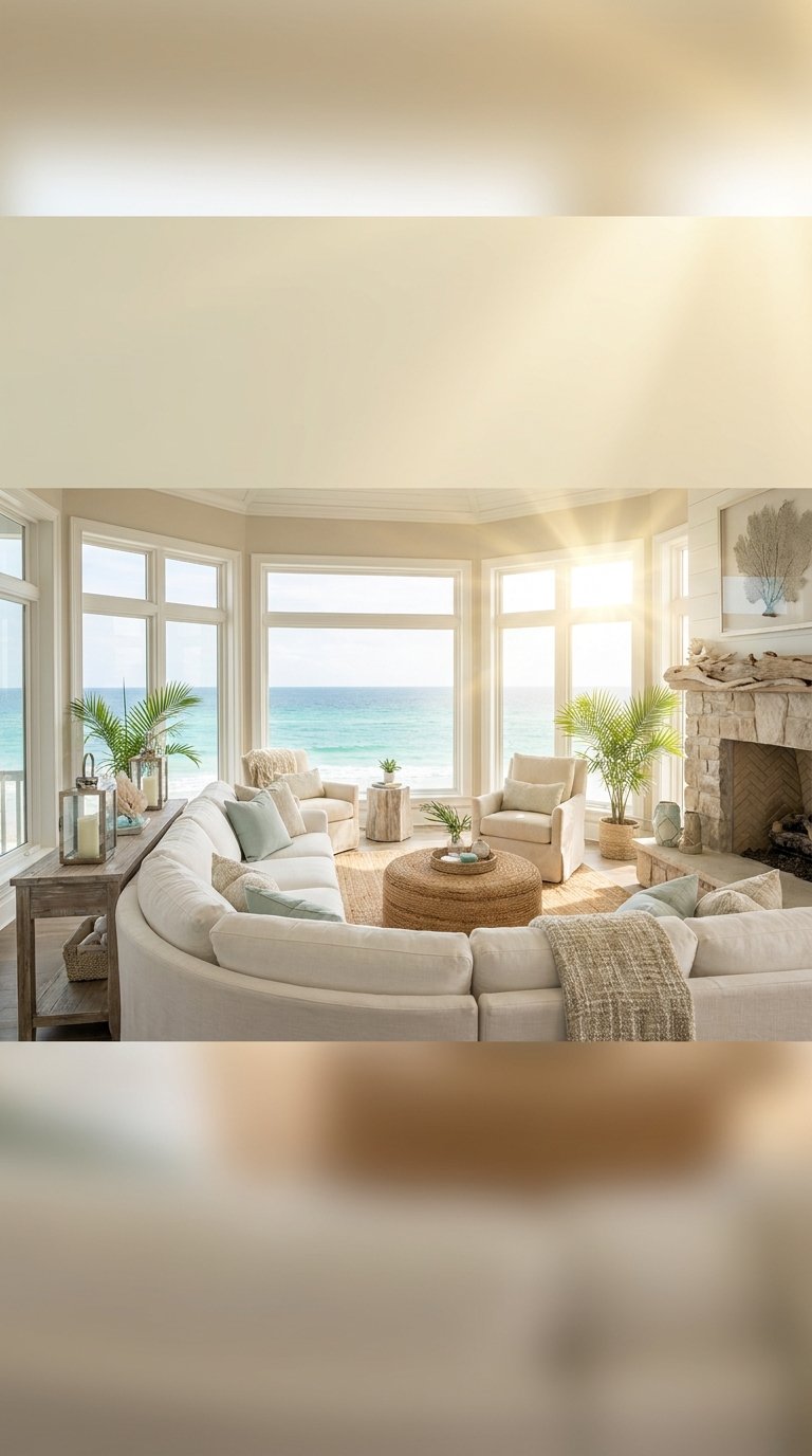
The coastal look at its best is not about anchors and rope. It is about light that moves. Picture a room where the walls are the color of sun-warmed sand, the sofa sits low in a soft oyster linen, and sheer panels billow the smallest amount whenever a window opens. That subtle motion is the whole point.
The design principle at work here is tonal layering — using four or five shades of the same neutral family so that the eye travels through the room without landing hard anywhere. Warm whites, sandy beiges, chalky blues, and faded sage stack next to each other rather than compete. A single piece in a slightly deeper tone, like a driftwood-toned side table or a woven jute rug, grounds the palette without breaking it.
To build this look in a real room, start with a white or off-white sofa base — a slipcover is a low-cost route if you already own a sofa in a darker shade. Add a round rattan mirror hung opposite the largest window to push natural light further into the space. Swap out any heavy curtains for white sheer linen panels. Layer a washed linen throw in a soft blue-grey over the sofa arm. For the coffee table, a simple tray with a piece of driftwood, a white candle, and a small potted succulent gives the space that collected, unhurried quality that makes coastal rooms feel real rather than staged.
Pro Tip: A rattan-framed round mirror costs under $60 at most home stores and delivers one of the strongest light-amplifying effects of any decor piece at that price point.
Save this idea to your Pinterest.
Golden Hour Boho Lounge Glow
This look captures the quality of light between 5pm and sunset — amber-warm, low-angled, and almost edible. The palette pulls from ochre, turmeric, rust, and aged gold. It pairs best with dark rattan furniture, macramé wall pieces in natural cotton cord, and a low-slung sofa in a warm caramel or toffee upholstery.
The design logic is warm contrast — you are placing rich amber tones against softer, dustier versions of the same hue. A mustard yellow cushion against a caramel sofa reads as intentional rather than clashing because both tones sit in the same temperature family. Add a terra cotta pot cluster in one corner and a woven floor lamp in another to frame the room with warmth at two different heights.
Getting there is surprisingly achievable on a mid-range budget. The biggest-impact move is changing your lighting. Replace cool-white bulbs throughout with Edison-style warm bulbs rated around 2200K. The room literally changes colour in the evening. From there, add two oversized cushions in a block ochre or curry print. A macramé wall hanging above the sofa — found at most craft markets or online for $25 to $80 — completes the look without any painting or structural change.
Pro Tip: Layer two rugs — a flat-weave sisal base with a smaller hand-knotted wool piece layered on top at an angle. This breaks up the floor plane and adds the kind of depth that styled rooms always have and bare floors never do.
Sun-Kissed Bohemian Hammock Corner
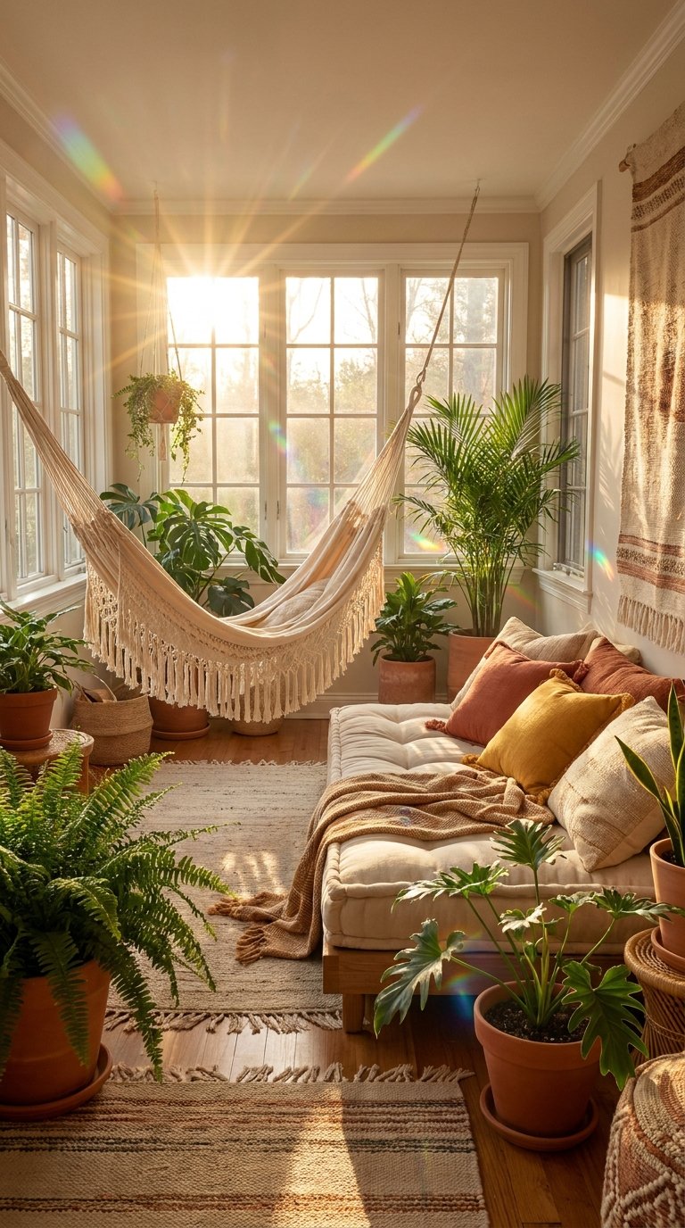
A hammock corner inside a living room is having a serious moment in 2026. It reads as relaxed without being careless, and it solves a very common problem: the awkward corner that never holds furniture well. A cotton rope hammock chair — the hanging kind mounted to a single ceiling hook — becomes a genuine destination in the room rather than dead space.
The principle behind this is functional zoning. Rather than treating the living room as one large sitting area pointed at a screen, this approach creates smaller moments within the space — a reading nook, a lounge spot, a conversation cluster. The hammock corner works as a defined zone using a round jute rug beneath it, a low side table beside it, and a warm-toned floor lamp standing just behind. These three elements tell the eye that this area has its own identity.
For the surrounding walls, a sun-faded linen wall hanging or a cluster of three rattan wall baskets in varying sizes gives the corner its warmth without requiring any artwork. Keep the colour palette in the same boho-summer range: ivory, warm sand, natural wood tones, and one accent in a dusty terracotta or faded rust. A single trailing pothos or hoya in a terracotta pot adds the organic element that ties the whole corner to the season.
Pro Tip: A cotton hammock chair needs a ceiling stud or a proper beam anchor. Use a load-bearing hook rated to at least 250 lbs — most swings of this style weigh under 10 lbs empty but the dynamic load when you sit adds significant force. A $12 toggle bolt is not sufficient.
Save this idea to your Pinterest.
Minimal Warm Wood Lounge Balance
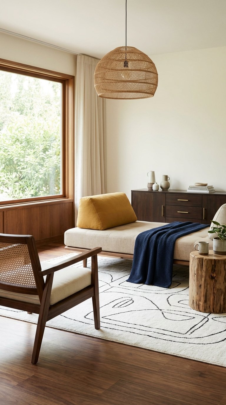
Warm minimalism is the corrective to cold minimalism — it uses the same clean lines and restrained object count, but grounds everything in materials with actual texture and temperature. Think blonde oak side tables, a low walnut TV console, and a sofa in a cream boucle or natural linen. Nothing fights for attention. Everything has a clear purpose.
The design principle is material hierarchy. In a minimal room, every object counts because there are so few of them. A single beautiful piece of raw-edge oak as a coffee table earns its place in a way that a glass table never quite does in summer — glass reads cold, and summer rooms want warmth underfoot and at eye level. Pair that table with a linen sofa in a warm oatmeal tone and a single large-leaf plant in a ceramic pot and the room feels complete at six pieces rather than sixty.
For implementation, the key move is restraint. Take everything off your surfaces first. Then place back only what you actually reach for or genuinely love. A stack of three books, one object with texture (a smooth stone, a ceramic bowl), and one living element (a plant or fresh flowers) is the standard composition for minimal surfaces in summer. The room breathes when objects have negative space around them.
Pro Tip: Warm oak tones shift beautifully in natural light throughout the day. Position your oak piece near your primary light source and watch it change from honey at noon to amber by evening — no accessories needed.
Playful Scandinavian Summer Living
Scandinavian summer design swaps the grey-white palette of Nordic winter interiors for something brighter and more playful. Think soft sage walls, white oak furniture, pastel textile accents, and an overall lightness that makes the room feel like early morning in June. The Scandinavian approach to summer is not maximalist — it is still clean and considered — but it allows colour and personality in a way that strict minimalism does not.
The guiding principle is hygge with colour. Hygge is the Danish concept of cosy well-being, and in summer it shifts from warm candlelight to open windows and lighter materials. Linen replaces wool. Pale sage and dusty rose replace charcoal and navy. White-painted floorboards (or a light-stained wood floor) with a flat-weave cotton rug in a stripe pattern sets the floor tone. A low sofa in soft white with scatter cushions in sage, blush, and pale yellow builds the palette upward.
The finishing details that make this look feel genuinely Scandinavian rather than just pastel are the small ones. Wooden candle holders in natural birch. A simple ceramic vase with a single stem of dried pampas or fresh cotton branches. Clean-lined bookshelves where books are stacked by colour. These are the touches that signal intention. Nothing is accidental, and nothing is expensive.
Pro Tip: The stripe cotton rug is your most versatile investment in this look. It works in a living room, a bedroom, and an outdoor space. Machine-washable versions are available from multiple brands for under $90.
Save this idea to your Pinterest.
Boho vs. Coastal vs. Scandinavian — Quick Comparison
When you are deciding between the three most popular summer living room styles right now, this table makes the differences clear:
| Feature | Boho Summer | Coastal Summer | Scandinavian Summer |
|---|---|---|---|
| Primary Palette | Ochre, rust, terracotta, warm brown | Sandy beige, chalk white, muted blue | Sage, blush, white, pale wood |
| Key Materials | Rattan, macramé, cotton, woven jute | Linen, driftwood, sea glass, woven seagrass | White oak, cotton, ceramic, birch |
| Lighting Style | Warm amber, Edison bulbs, candles | Natural light maximised, sheer panels | Diffused soft light, large windows |
| Texture Level | High — layered and mixed | Medium — restrained and organic | Low to medium — clean lines |
| Best For | Renters, budget decorators, bold personalities | Beach-adjacent homes, neutral lovers | Small spaces, tidy aesthetics |
| Biggest Mistake | Too many patterns at once | Making it feel like a gift shop | Going too grey; losing the warmth |
Get The Look — Boho Summer Starter Kit:
- Macramé wall hanging (natural cotton cord, 24″ wide minimum)
- Rattan floor mirror (round, 60″ tall)
- Jute rug in a natural or banded stripe
- Edison bulb string lights or a rattan pendant light
- Two oversized cushions in ochre and rust
- One terracotta pot cluster (three sizes)
Refined Neutral Summer Elegance
Refined neutrals in summer 2026 are not the flat beige-on-beige quiet luxury of recent years, which designers are now openly calling lifeless. The new version adds depth through material contrast — a cream linen sofa sits next to a warm stone side table, a textured wool-silk blend rug grounds the floor, and a single sculptural lamp in aged brass provides the one element of warmth that anchors the whole composition.
The design principle at work is tonal contrast through material, not colour. Two pieces can share almost the same shade but feel completely different depending on whether one is matte and one is glossy, or one is soft and one is rigid. A cream ceramic vase next to a cream linen cushion reads as layered and rich. The same cream cushion next to a cream painted shelf reads as flat. Material variety is the move.
Building this look takes patience with editing. Start with your biggest neutral — usually the sofa — and work outward, varying the finish and texture of every piece that follows. The curtains should be slightly warmer than the walls. The rug should be slightly warmer still. The cushions can be two or three shades apart from each other but all sitting in the cream-to-sand-to-linen family. One brass accent — a candle holder, a small tray, the frame of a mirror — completes the look without tipping it into maximalism.
Pro Tip: Fresh white flowers, particularly ranunculus or garden roses, are the strongest single accent piece in this palette. They cost under $15 from most supermarkets and carry more visual weight than any decorative object at the same price.
Pastel Modern Dream Living Room
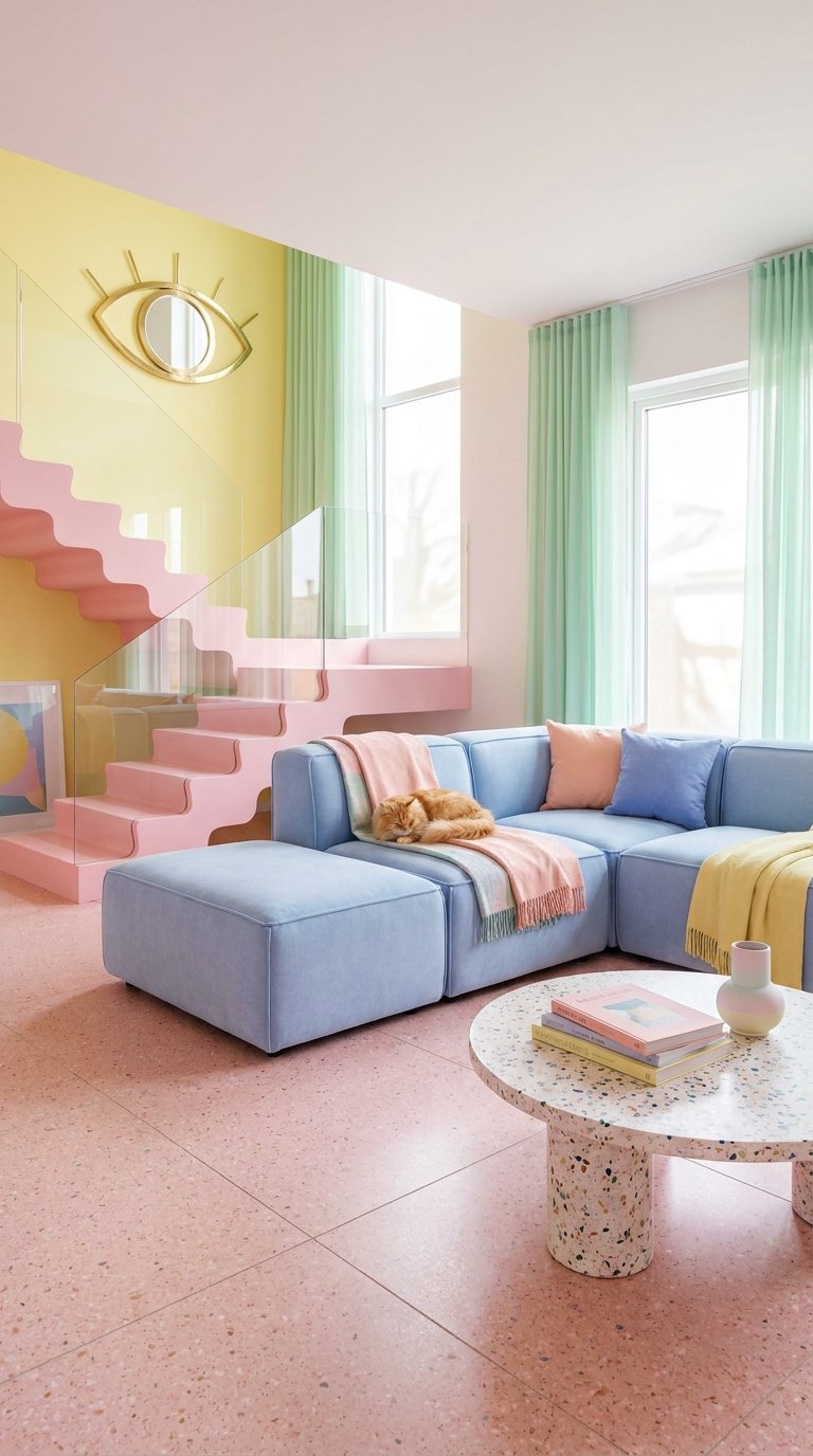
Pastels in 2026 are not the washed-out, chalky shades of early Instagram aesthetics. They are richer and more considered — a blush that leans slightly peach, a lavender that has enough grey in it to feel grown-up, a mint that sits closer to sage than spearmint. Paired with clean modern furniture lines and warm lighting, this palette produces rooms that feel both fresh and genuinely liveable.
The design principle is saturation control. Pastels succeed when the background is neutral enough to let the colour breathe. A warm white or soft plaster wall tone lets a blush sofa read clearly without competition. A stone-coloured floor (wood, tile, or polished concrete in a warm tone) sits below the pastel colour rather than fighting with it. The ceiling stays white. This framework makes even a bold blush feel calm rather than chaotic.
For a small living room, the pastel modern approach is one of the strongest options available because light tones expand perceived space. A blush linen sofa, a white fluted side table, a single round mirror, and a sage green plant in a white ceramic pot gives the room enough personality to feel styled without the visual weight that darker tones bring. No curtains — or sheer white panels only — keeps the light at maximum.
Pro Tip: Blush and sage together are the strongest two-tone combination in this palette for 2026. Use blush for large surfaces (sofa, cushion, throw) and sage for the living accents (plants, a single cushion, a candle holder in glazed ceramic).
Save this idea to your Pinterest.
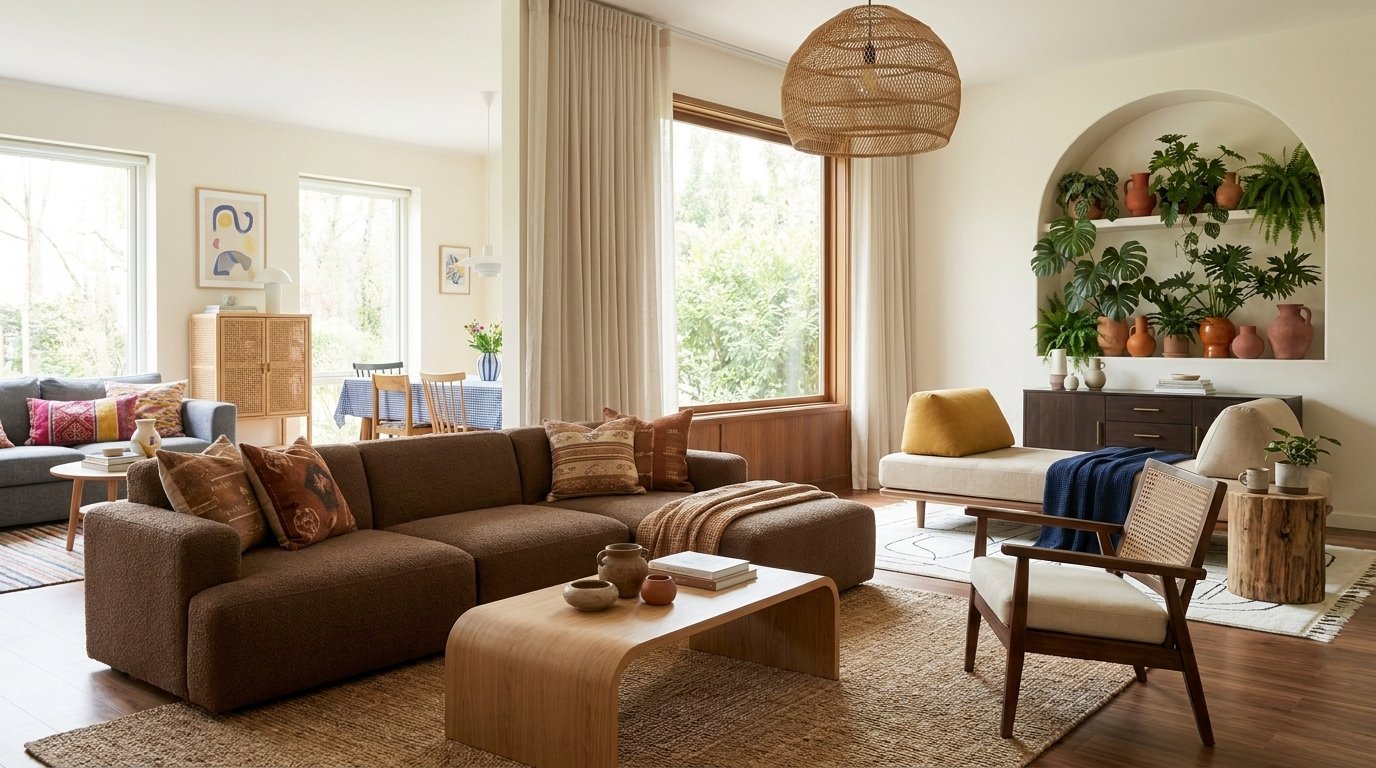
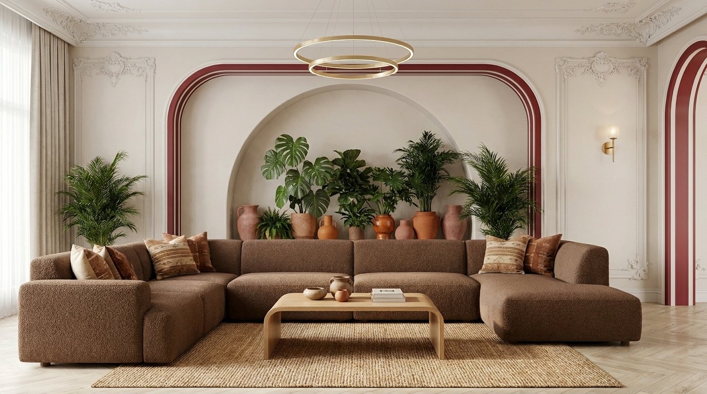
Terracotta Earth-Toned Summer Lounge
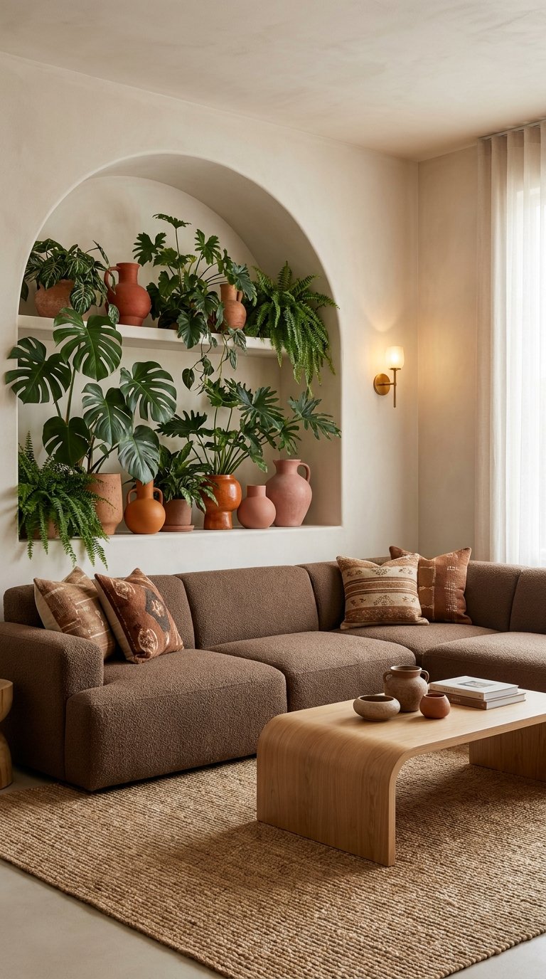
Terracotta is the colour of sun-baked clay, and it brings that same quality into a room — warm, grounded, and slightly ancient. In a summer living room it works as an accent or as a dominant tone, and in 2026 the trend is moving toward the latter. Full terracotta walls, terracotta upholstery, and terracotta accessories sitting together in a room feel bold on paper but surprisingly serene in practice because they all pull from the same thermal warmth.
The design principle is monochromatic depth. When a single hue dominates a space, the room reads as intentional rather than cluttered. Varying the shade — a burnt sienna cushion, a pale clay wall, a deep rust throw — creates movement within the colour family. Natural materials like raw linen, unglazed ceramic, hand-knotted jute, and waxed cotton add texture that keeps the monochromatic palette from going flat.
To bring this into a real room without painting every wall terracotta (though that works beautifully if you own the space), start with a terracotta throw and two cushions in the same family against a neutral sofa. Add a cluster of three terracotta pots in different sizes and heights in one corner — an olive tree in the tallest, a trailing pothos in the middle, and a small cactus in the smallest. This corner anchors the colour in a way that feels collected rather than matched.
Pro Tip: Unglazed terracotta pots develop a patina over time as mineral salts from the soil migrate to the outside surface. Many decorators consider this natural ageing the most attractive version of the material. Let it happen — don’t scrub it.
Vintage-Inspired Pink Eclectic Living Room
Pink in a living room used to feel risky. In 2026 it feels inevitable. The shift is in the tone — away from bubblegum and candy pink, toward dusty rose, aged blush, and the kind of faded pink you see on old Parisian buildings. Paired with vintage furniture, mismatched frames, layered rugs, and one or two genuinely old pieces from a thrift store or estate sale, this look produces rooms that feel both personal and deeply stylish.
The design principle is curated eclecticism — the art of mixing different eras, finishes, and origins in a way that feels intentional rather than accidental. The key is to let one consistent element (in this case, the dusty rose palette) run through every piece as a common thread. A vintage velvet armchair in a faded blush, a 1970s-style curved sofa in a warm ivory, a gallery wall mixing old portrait prints with abstract art in blush-toned frames — these pieces are from different decades but the pink thread connects them.
For the DIY route, charity shops and Facebook Marketplace are the best sources for this look. Look for armchairs with good bones that need reupholstering in a blush velvet ($30 to $80 for fabric, plus labour or DIY time). Mismatched picture frames can be spray-painted in a single warm white or aged gold tone to unify a gallery wall cheaply. One large vintage-style floor lamp in a brass or antique gold finish brings the whole room into the right era.
Pro Tip: The most common mistake with this look is adding too much pink at once. Keep the base of the room (sofa, walls, floor) in a warm ivory or neutral. Let the pink live in the accent pieces — cushions, throws, one statement chair, and small ceramics.
Save this idea to your Pinterest.
Classic Modern Cream and Gold Living Room
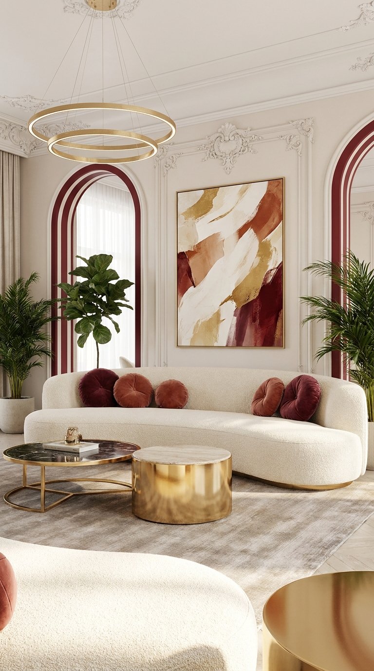
Cream and gold is the most enduring combination in residential interiors — it predates trends and it will outlast them. In summer 2026 the updated version strips away the heavy traditional elements (dark wood, ornate moulding, formal symmetry) and replaces them with cleaner shapes and lighter materials. The result is a room that reads as quietly luxurious without the stiffness of traditional decor.
The design principle is restrained glamour. Gold used sparingly carries enormous visual weight. A single aged-brass floor lamp beside a cream linen sofa is already a design statement. Three gold elements in one room — a lamp, a small tray, the legs of a side table — creates coherence. More than that, and the room tips toward decoration overload. The cream base does the heavy lifting, and gold provides the accent.
For the cream palette itself, the key is avoiding pure white alongside cream — the two tones fight each other. Choose one and stick to it throughout. A warm cream linen sofa with cream-painted walls (choose a tone like ‘Clotted Cream’ or ‘Old White’) creates a unified backdrop. The gold accents read more clearly against that consistency. A soft ivory boucle throw, a stack of coffee table books with light-toned spines, and a single seasonal flower arrangement in a gold vase complete the summer version of this classic look.
Pro Tip: Aged brass is warmer and more forgiving than bright gold in natural light. It develops a slight patina over time that adds character. If you are choosing between a polished gold and an aged brass accessory, brass almost always performs better in a cream room in daylight.
Get the Summer Living Room Look — Materials Checklist
Natural Texture Foundation:
- Jute or seagrass rug (minimum 8×10 for a standard living room)
- Rattan or cane furniture piece (mirror, chair, pendant, or side table)
- Linen upholstery or linen slipcover for sofa
Light Control:
- Sheer linen or cotton curtain panels in white or natural
- Warm-tone light bulbs (2200K to 2700K) throughout
Seasonal Accent Pack:
- Two cushions in a seasonal colour (see your chosen style above)
- One throw in a natural fibre (cotton, linen, or light wool)
- Fresh or dried botanicals in a ceramic or terracotta vessel
Optional Statement Pieces:
- Round rattan or wicker wall mirror
- Macramé wall hanging (for boho or coastal styles)
- Brass or aged-gold accent (lamp base, tray, vase, or picture frame)
- Indoor plant in a terracotta or ceramic pot (one large or three small)
Budget note: A complete summer refresh using this checklist runs between $120 and $400 depending on what you already own. The single highest-impact purchase at any budget level is the warm-tone light bulb swap — at under $20, it changes the entire evening atmosphere of the room.
Popular Asked Questions
What colours work best for a summer living room in 2026?
The strongest summer living room colours for 2026 are warm and grounded rather than bright. Sand tones, creamy whites, terracotta, sage green, dusty blue, and buttery yellow are the palette most designers and trend reports are pointing to this year. These shades create a bright, airy feeling without the harshness that pure white can bring in direct sunlight. For a summer living room decor refresh, pick two tones from this group — one for large surfaces and one for accents — and you will have a cohesive result without overthinking the palette.
How can I make my small living room feel bigger in summer?
The most effective moves for a small living room in summer are all about light and visual weight. Swap heavy curtains for sheer panels, which allow natural light to move through the whole space. Choose a sofa with legs rather than a floor-sitting base — the visible floor gap makes the room feel less blocked. A large round mirror on the main wall doubles the perceived depth of the space. For summer living room decor on a budget, these three changes (sheers, a legged sofa, and one mirror) deliver the biggest size-expanding result for the least money.
What is the best way to refresh a living room for summer without buying new furniture?
A summer living room refresh without new furniture comes down to four things. Replace your throw cushions with seasonal colours in light linen or cotton. Swap your throws and blankets for lighter-weight versions in natural fibres. Change your light bulbs to warm-tone options (2200K to 2700K). Add one or two indoor plants in terracotta or ceramic pots. These four steps cost between $30 and $100 total and shift the entire atmosphere of the room toward the season. Summer home decor ideas do not require a room overhaul — they require the right small edits.
Is terracotta still a good choice for living room decor in 2026?
Terracotta is one of the strongest and most versatile tones for summer living room decor in 2026. It works as an accent through cushions, pots, and ceramics, or as a dominant wall colour in rooms that get good natural light. Design consensus this year confirms that terracotta earth tones feel fresh rather than dated when paired with natural linen, raw wood, and warm white — the 2026 approach moves away from the ultra-neutral palette of recent years toward these grounded, personal tones. It is a solid long-term investment for a living room colour direction.
What natural materials should I use for a summer living room?
The natural materials most used in summer living room decor ideas for 2026 are rattan, jute, linen, raw cotton, unglazed ceramic, and light-toned wood (oak, birch, pine). These materials all share warm, organic qualities that read as summery without heavy visual weight. Rattan works especially well in furniture and lighting. Jute and seagrass make strong rug choices. Linen performs across upholstery, cushion covers, and curtains. One piece in each of these material groups gives the room the textural richness that makes styled summer spaces feel genuinely different from year-round interiors.
Conclusion
Summer 2026 living room decor is moving in a clear direction — warmer, more personal, more textured, and built around real materials rather than trends that expire in six months. Whether you connect with the breezy calm of a coastal retreat, the amber warmth of a boho lounge, the earthy depth of a terracotta corner, or the quiet luxury of cream and gold, the path forward is the same: choose a palette that feels like you, invest in natural materials, and let light do most of the work.
Every single look in this list is achievable without a major renovation. Some of the most effective summer transformations here cost less than $100.
Which of these ten summer living room styles feels most like your space? Leave a comment below — we read every one.
Follow us on Pinterest for more summer living room decor inspiration, seasonal refresh guides, and room-by-room styling ideas.

Leave a Comment