
So you went ahead and bought yourself a white, cream, or ivory sofa. Maybe your family thought you were crazy. Maybe your friends raised their eyebrows and asked if you’d lost your mind. But here’s what I’m going to tell you right now: you made one of the smartest furniture decisions you could possibly make.
I’ve been around enough living rooms to know that light-colored sofas get a bad reputation. People think they’re impractical. They imagine coffee stains and pet hair and all the disasters that could happen. But what they don’t see is the incredible flexibility these pieces give you. A light sofa becomes this blank canvas that lets you completely transform your space without buying new furniture every time you get bored with your decor.
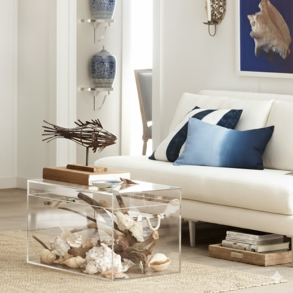
Think about it this way. You buy a dark navy sofa, and you’re pretty much locked into a specific color scheme. Navy goes with certain colors and clashes with others. You can’t just wake up one morning and decide to go in a completely different direction. But a cream sofa? That thing plays well with everybody. It’s like the friend who gets along with all your other friends and never causes drama at parties.
The welcoming feeling you get from a light sofa is something that darker pieces just can’t match. When someone walks into a room with a white or ivory sofa, the space feels open and airy. It doesn’t matter if your living room is tiny or huge. That light color bounces light around and makes everything feel bigger and more inviting. I’ve seen cramped apartments transform into spaces that feel twice their size just by switching from a dark couch to a light one.
Now, I’m not saying maintenance is zero. You’ll need to be a bit more careful, sure. But modern fabrics have come so far that many light sofas are actually easier to keep clean than you’d think. Scotchgard exists. Washable slipcovers exist. Steam cleaners exist. We’re not living in the 1950s anymore where one spill meant your furniture was ruined forever.
The real magic of choosing a light-colored sofa is what you can do with it. You’re not stuck with one look. You can swap out pillows and throws and suddenly you’ve got a completely different room. Want to go modern one month and bohemian the next? Your sofa doesn’t care. It’ll work with both. That kind of versatility is worth its weight in gold when you consider how expensive furniture is these days.
I’m going to walk you through several ways to make your light sofa the star of your living room. These aren’t complicated designer tricks that require a degree in interior decorating. They’re practical ideas that real people can actually use in real homes. Some of them might surprise you. Some might seem obvious once you hear them. But all of them work.
Going Bold With a Single Solid Color
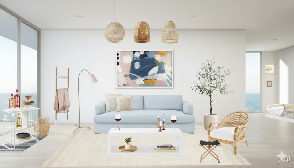
Here’s an approach that seems simple but creates serious impact. You take your light sofa and you dress it up with cushions in just one solid color. Not two colors. Not three. One. The trick is picking the right color and committing to it fully.
I learned this technique from a designer friend who worked on high-end hotel lobbies. She told me that the most sophisticated looks often come from restraint, not from throwing every color at a space. When you put black cushions on a white sofa, you create this striking contrast that makes both colors look more intentional. The white seems whiter. The black seems richer and deeper.
But black isn’t your only option here. You could go with a deep charcoal gray for something slightly softer. You could choose a rich burgundy if your room has warm undertones. Navy blue works beautifully if you want something that feels classic and timeless. The key is that whatever color you pick needs to work with everything else in your room.
Let me give you a real example. I once helped a neighbor who had this gorgeous cream sofa but couldn’t figure out how to make it work with her space. Her living room had these beautiful wooden floors and some rustic elements. We went with burnt orange cushions, all in the same shade. Just four or five pillows, all that warm, earthy orange. The transformation was incredible. The sofa went from looking washed out to looking like a deliberate design choice.
The beauty of the single-color approach is that it’s forgiving. You don’t have to worry about whether patterns clash or if you’ve got too many colors competing for attention. You make one decision and you run with it. When people walk into your room, their eye immediately understands what you’re doing. There’s a clarity to the design that feels both intentional and effortless.
You want to pay attention to the shade you choose. This matters more than you might think. A bright, fire-engine red might be too aggressive for most spaces. But a deeper, wine-colored red could be perfect. Test your colors in the actual lighting of your room before you commit. Colors look completely different in natural daylight versus lamp light at night. Buy one pillow first, live with it for a few days, see how it makes you feel.
The texture of your solid-color pillows matters too. You could go with smooth velvet for a luxurious feel. Linen gives you a more casual, lived-in vibe. Cotton is practical and easy to wash. I personally love mixing textures even within a single color. You might have three navy velvet pillows and two navy linen ones. They’re all the same color, so you keep that clean, unified look, but the different textures add depth and interest.
One mistake people make with this approach is going too matchy-matchy with the rest of the room. If you choose black cushions, you don’t need to then find black everything else. The cushions should connect to your color scheme, sure, but they don’t need to perfectly match your curtains or your rug or your picture frames. Let them be their own statement.
Think about scale when you’re choosing your pillows. You want different sizes to create visual interest. Maybe you’ve got two large square pillows in the back, a couple of medium rectangular ones in front, and a smaller accent pillow or two. All the same color, but the varying sizes keep things from looking too stiff or formal.
Pulling From Your Room’s Existing Color Palette
Every room tells a story through its colors. You’ve got your wall color, your curtains, maybe some artwork, a rug, a chair, a lamp. All these elements combine to create a color palette whether you planned it that way or not. Your sofa cushions can tie all these pieces together in a way that makes your whole room feel cohesive and thoughtfully designed.
This approach requires you to actually look at your room and identify what colors you’re already working with. Stand in your doorway and scan the space. What colors jump out at you? What shades keep appearing? Maybe you’ve got a lot of blue going on. Perhaps there’s a green theme you hadn’t fully noticed. Could be you’ve got pops of yellow here and there that could use some reinforcement.
I remember working on my own living room and realizing I had this accidental mustard yellow theme happening. My curtains had a subtle yellow pattern. The binding on one of my books on the coffee table was yellow. A throw blanket my mom gave me had yellow in it. I hadn’t planned any of this. But once I saw it, I leaned into it. I got a couple of mustard yellow cushions for my cream sofa, and suddenly everything clicked. The room went from feeling random to feeling curated.
The cushions you choose don’t all have to be the same color when you’re working with a palette approach. You can have one pillow that matches your curtains, another that picks up the color of your favorite chair, and a third that echoes a shade in your area rug. The variety keeps things interesting while still feeling coordinated.
Let’s talk about proportion for a second. If you’ve got a large element in your room that’s a particular color, like big navy curtains, you don’t need five navy pillows on your sofa. One or two is plenty. You’re creating echoes of color throughout the space, not trying to divide colors equally like you’re splitting a pie into exact portions.
Artwork gives you a goldmine of color inspiration. That painting or print hanging on your wall probably has three to five main colors in it. Pull one of those colors onto your sofa with cushions. This creates a dialogue between your art and your furniture that makes both look more intentional. I’ve seen rooms completely elevated by this simple trick.
Don’t forget about wood tones and metal finishes. These count as part of your palette too. If you’ve got a lot of warm wood furniture, that influences whether you should lean toward warm or cool colors in your cushions. If you’ve got brass or gold accents scattered around, you might want cushions in colors that complement metallics, like deep greens or rich blues.
Here’s something that trips people up about working with an existing palette. You don’t have to use every single color in your room on your sofa. That would be overwhelming. Pick two or three colors from your palette and focus on those. Let the rest of your room’s colors do their own thing. Your sofa doesn’t need to be a rainbow that represents every shade in your space.
Neutral rooms benefit hugely from this palette approach. If most of your room is beige, gray, and white, your cushions become the place where you can inject the actual color. Maybe you’ve got one piece of art with some coral in it. Pull that coral onto your sofa and suddenly your whole neutral room has a focal point and a personality.
The palette approach lets you change things up seasonally without spending much money. You might go with cooler colors in summer and warmer ones in winter, all while staying within your established palette. Swap out a few pillows and you’ve refreshed your whole room. This is the flexibility that makes light-colored sofas such a smart investment.
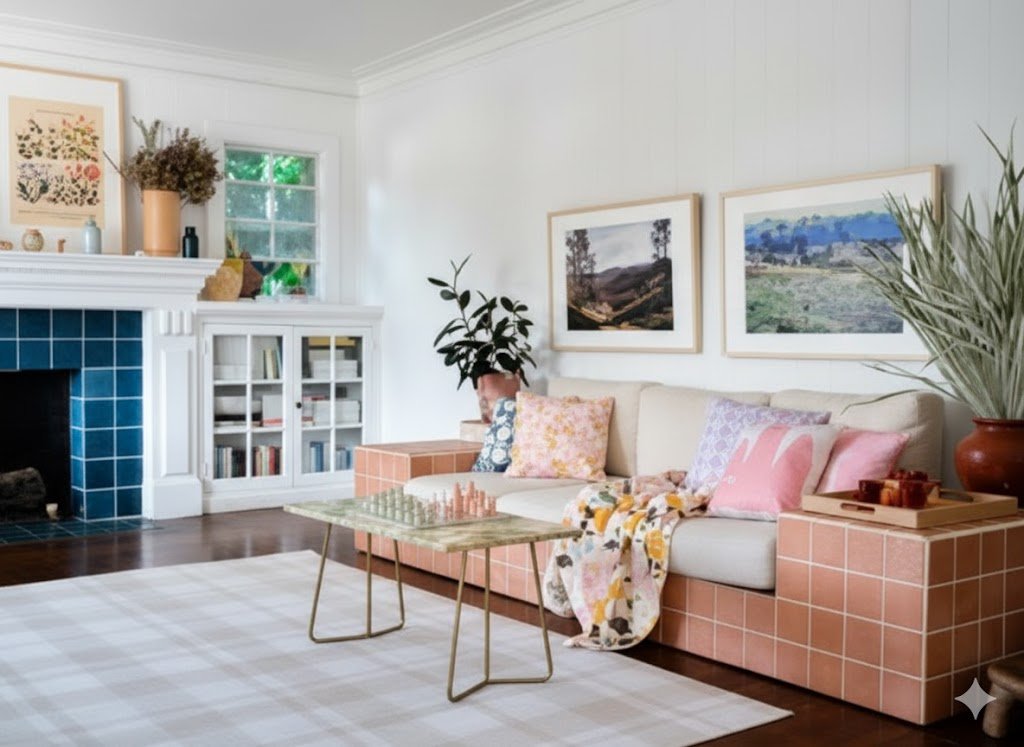
Adding Character Through Patterns and Prints
Patterns scare some people. I get it. They’re worried about choosing the wrong pattern or mixing patterns that clash or making their room look too busy. But patterns are where personality lives. A solid-colored pillow is nice. A patterned pillow tells a story.
The first thing you need to know about patterned cushions is that you have to commit to a color scheme first. Pick your base color, the shade that’s going to ground your pattern choices. Maybe it’s the same blue that’s in your rug. Maybe it’s a green that appears in your curtains. This base color becomes your anchor, and you look for patterns that feature it prominently.
Geometric patterns work beautifully on light sofas. Stripes, chevrons, hexagons, moroccan tiles. These patterns feel modern and clean. They add visual interest without overwhelming your space. I’m particularly fond of a good stripe. There’s something about horizontal or vertical lines that adds structure to a room. They make everything feel more orderly and intentional.
Floral patterns get dismissed as too traditional or too feminine, but that’s selling them short. A contemporary floral print in the right colors can feel fresh and current. The key is scale. Large, bold florals make a statement and feel modern. Tiny, delicate florals can read as dated if you’re not careful. Choose your florals with confidence and they’ll serve you well.
Mixing patterns is an art, not a science, but there are some guidelines that help. You want to vary the scale of your patterns. If you’ve got a large-scale geometric print on one pillow, pair it with a smaller-scale pattern on another. Maybe you’ve got one big bold stripe and one tiny polka dot. The difference in scale keeps them from competing with each other.
I learned this trick from an interior designer I met at a furniture store. She told me to think about patterns in terms of personalities. You’ve got your loud, outgoing pattern that wants all the attention. That’s your large-scale, bold print. Then you’ve got your supporting cast, the medium and small patterns that complement the star without trying to upstage it. And you’ve got your solid colors that act as the quiet, steady friend who makes everyone else look good.
Color repetition is what makes pattern mixing work. If your geometric pillow has navy and white, and your floral pillow has navy, white, and a touch of green, they’ll play well together because of that shared navy. The patterns are different, but the color connection ties them together. This is your safety net when you’re experimenting with multiple patterns.
Texture adds another dimension to patterned pillows. An embossed pattern on velvet catches light differently than a printed pattern on cotton. You could have a geometric pattern that’s woven right into the fabric, creating texture you can feel. These tactile patterns add richness without adding more visual information to process.
Let’s talk about where patterns can go wrong. Too many competing patterns in the same visual field creates chaos. Your eye doesn’t know where to land. If you’re going to use multiple patterned pillows, balance them out with some solid ones. Maybe you’ve got two patterned pillows and three solid ones. That ratio works well for most sofas.
Cultural and global patterns bring character and worldliness to your space. Ikat, suzani, mudcloth, shibori. These patterns have histories and stories behind them. They make your room feel collected and traveled, even if you bought them all online. I have a set of pillows with a West African mudcloth pattern, and people always comment on them. They add a layer of interest that solid colors just can’t match.
Seasonal pattern swaps keep your room feeling current. You might go with lighter, airier patterns in spring and summer. Think botanical prints or nautical stripes. Then switch to richer, more complex patterns in fall and winter. Plaids, paisleys, damasks. This seasonal rotation means you never get bored with your space.
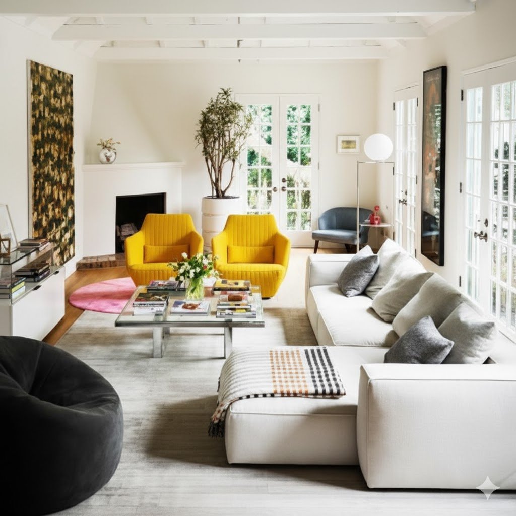
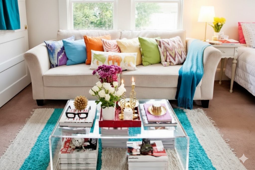
Making a Statement With Bright and Bold Colors
Sometimes you just need to go big. Forget subtle. Forget understated. You want your sofa to grab attention and make people smile when they walk in. This is where bright, saturated colors come in, and they can transform your light-colored sofa into the focal point of your entire room.
I’ll be honest with you. This approach isn’t for everyone. If you’re someone who prefers calm, quiet spaces where everything whispers instead of shouts, you might want to skip to the next section. But if you’re someone who believes your home should energize you, who thinks color is one of life’s great pleasures, then keep reading.
Red is the classic bold choice, and there’s a reason it’s been popular forever. Red demands attention. It raises energy levels. It makes a statement that can’t be ignored. But here’s the thing about red on a white or cream sofa. It looks expensive. I don’t know what it is about that particular combination, but it reads as high-end design even if you bought your pillows at a discount store.
Yellow is having a moment right now, and I’m here for it. Not the pale, buttery yellow that your grandmother might have chosen. I’m talking about deep mustard yellows, bright sunshine yellows, even chartreuse if you’re feeling adventurous. Yellow lifts your mood. Science backs this up. Color psychology tells us that yellow stimulates mental activity and generates muscle energy. Your living room could use some of that.
Let me tell you about the time I convinced my skeptical brother to try emerald green pillows on his ivory sofa. He thought it would look ridiculous. He was wrong. That rich, jewel-toned green against the neutral background created this luxurious, almost regal look. It completely changed how his room felt. What had been a bland, forgettable space became somewhere you wanted to spend time.
Purple gets overlooked, and that’s a shame. Deep purples, especially, can add sophistication while still being bold. I’m talking about eggplant, plum, royal purple. These shades have a richness to them that feels both modern and timeless. They work beautifully in rooms with gray undertones or cool color schemes.
Blue might not seem like a bold choice, but the right shade of blue absolutely qualifies. Cobalt blue, turquoise, electric blue. These aren’t your safe, navy blues. These are blues that wake you up in the morning and keep you alert. A turquoise pillow on a white sofa brings in that tropical, beachy vibe without going full coastal decor.
The trick with bold colors is knowing how much is enough. You don’t need to cover your entire sofa in screaming red pillows. Two or three bright pillows mixed with some neutral ones creates balance. You get the impact of the bold color without overwhelming your senses every time you walk in the room.
Think about your room’s natural light when you’re choosing bold colors. A room with tons of sunlight can handle deeper, more saturated shades. The natural light keeps them from feeling too heavy. A darker room might need brighter, more vibrant shades to bring in that sense of energy and light. The same red pillow can look completely different in a sunny room versus a dim one.
Bold doesn’t have to mean solid. You can find bold colors in patterns too. A pillow with a bright geometric print that uses multiple saturated colors can deliver that wow factor while adding pattern interest. This gives you more flexibility in how you style your sofa.
Here’s a confession. I used to be afraid of bold colors. I thought they were for braver people than me. I played it safe with beiges and soft blues and never took risks. Then I bought one bright coral pillow on a whim. Just one. It sat on my cream sofa looking absolutely perfect, and I realized I’d been denying myself something that brought me joy. Now I rotate through bold colors with confidence.
Color trends come and go, but your personal response to color is what matters. If a color makes you happy every time you see it, that’s the right color for you. Don’t choose something just because a magazine says it’s trendy this year. Choose it because it speaks to you.
Creating Timeless Elegance With Muted and Dark Tones
Not every room needs to shout. Some spaces call for quiet sophistication, for colors that suggest rather than announce, for a palette that feels grown-up and refined. This is where darker, more muted tones come into play, and they can give your light sofa an entirely different kind of presence.
Gray is the unsung hero of sofa styling. Not boring gray. I’m talking about charcoal, slate, pewter, the kind of grays that have depth and complexity. These shades against a white or cream sofa create a modern, almost architectural look. It feels deliberate and designed without trying too hard. Gray doesn’t compete with your other design elements. It supports them and makes them look better.
Brown often gets dismissed as boring, but that’s a failure of imagination. Rich chocolate brown, warm taupe, camel, cognac. These are sophisticated shades that bring warmth without brightness. They’re especially good if your room has a lot of wood furniture or warm-toned floors. A camel-colored pillow on a cream sofa barely contrasts in terms of lightness, but the warmth difference creates subtle interest.
Navy blue deserves its own discussion in the dark tones category. Navy is the chameleon of colors. It reads as neutral, but it’s not. It has depth and richness that true neutrals lack. Navy pillows on a light sofa feel classic and preppy in one room, nautical in another, sophisticated in a third. The context shapes how navy is perceived, which makes it incredibly versatile.
Olive green is underused in interior design, and I think that’s a mistake. It’s a complex color that brings the outdoors in without being obviously green. Olive has gray undertones that keep it from being too bright or too natural-looking. It pairs beautifully with wood tones and works well in rooms that skew masculine or industrial in style.
Let’s talk about the power of tone-on-tone styling. You take your cream sofa and dress it with pillows in slightly different shades of cream, beige, and light taupe. This creates layers of subtle color that feel incredibly sophisticated. It’s a technique you see in expensive hotels and high-end design magazines. The effect is calming and luxurious.
Dark tones give you flexibility in terms of maintenance. Let’s be real about this. Light pillows on a light sofa show every speck of dirt and dust. Dark pillows hide a multitude of sins. If you have kids, pets, or a tendency to eat on your couch (no judgment, we all do it), darker pillows make your life easier.
The psychology of dark tones in decor is interesting. Dark colors make a space feel more intimate and cozy. They draw the eye and create focal points. When you put dark pillows on a light sofa, you’re creating a deliberate contrast that anchors the room. The sofa becomes a destination, a place where you want to settle in and stay.
Texture becomes more important when you’re working with muted and dark colors. Without the interest that bright colors provide, you need texture to keep things visually engaging. Think about chunky knits, soft suede, nubbly linen, smooth leather. These tactile elements add dimension to your darker palette.
Metallics can elevate dark tones beautifully. A dark gray pillow with silver threading catches light and adds sparkle. A brown pillow with copper accents brings warmth and richness. These metallic touches keep dark colors from feeling too heavy or somber.
I worked with a client once who wanted her living room to feel like a luxury hotel room. We went with all muted tones on her white sofa. Grays, taupes, soft blacks, one deep navy. No bright colors anywhere. The result was stunning. The room felt expensive and serene, like somewhere you’d want to have quiet conversations and sip good wine.
Seasonal considerations matter with dark tones. These colors can make a room feel warmer in winter, which is great. But in summer, a sofa covered in dark pillows might make your space feel too heavy. Consider having a lighter set of pillows for warm months and saving your dark tones for fall and winter.
The beauty of muted and dark tones is their staying power. Bright colors can feel dated quickly. What seems fresh and current now might look tired in a few years. But grays, browns, navies, and olives? These colors have been working in interior design for decades and they’ll keep working for decades more. They’re an investment in timeless style.
Bringing It All Together
Your light-colored sofa is more than just a place to sit. It’s a canvas for self-expression, a tool for transforming your space, and one of the smartest furniture investments you can make. The flexibility it offers is unmatched by darker pieces, and the welcoming atmosphere it creates makes your living room a place where people want to gather.
The approaches I’ve outlined here aren’t mutually exclusive. You might start with bold colors, live with them for a while, then switch to muted tones when your mood changes. You might mix patterns in summer and go solid in winter. The point is that you have options. Your sofa adapts to your changing tastes and needs without requiring you to buy new furniture.
Don’t be afraid to experiment. Pillows are relatively inexpensive compared to furniture. If you try something and it doesn’t work, you’re only out a small amount of money and you’ve learned something about your own taste. The worst that happens is you end up with some extra pillows in your closet. The best that happens is you discover a look you love.
Pay attention to how your room makes you feel. Colors and patterns affect our moods and energy levels in real, measurable ways. If your current setup makes you feel tired or stressed when you walk in, change it. If it makes you happy and energized, you’ve nailed it. Your home should serve you, not the other way around.
Keep proportion in mind as you style your sofa. A small loveseat doesn’t need seven pillows. An oversized sectional can handle more. Three to five pillows is a good range for most standard sofas. You want enough to create visual interest without making your sofa unusable for actual sitting.
Quality matters more than quantity. One beautiful, well-made pillow in the perfect color will do more for your room than five cheap pillows that look good from a distance but fall apart quickly. Save up for the good stuff if you need to. Your sofa will look better and you’ll save money in the long run by not having to replace things constantly.
Think about the view from different angles. Your sofa probably looks different from your dining area than it does from your entryway. Walk around your room and see how your styling choices work from various perspectives. This helps you create a cohesive look that works from every angle.
Don’t forget about the rest of your sofa styling. Pillows are important, but so are throws and blankets. A carefully draped throw can add color, texture, and visual interest. It also serves a practical purpose for those of us who get cold easily. Layer your sofa styling just like you’d layer your outfit.
Remember that rules in design are meant to be broken. If something “shouldn’t” work according to traditional design principles but you love it, go for it. Your home is yours. It should reflect your personality and make you happy. Design rules are guidelines, not laws.
The journey of styling your light-colored sofa is ongoing. Your taste will evolve. New colors will catch your eye. Your life circumstances will change. That’s the beauty of starting with a neutral base. You can grow and change and your sofa grows and changes with you. It’s a partnership that can last for years.
Take photos of your room as you try different styling approaches. Sometimes we can’t really see what’s working and what’s not when we’re standing in the middle of it all. A photo gives you perspective. It lets you see your space the way a visitor would see it. You might be surprised by what you notice.
Trust your instincts. You know your space better than any designer or any article can tell you. If something feels right to you, it probably is right for your home. If something feels off, even if it looks good in a magazine, don’t force it. Design is personal, and your comfort matters more than following trends.
Your light-colored sofa was the right choice. Now you have the tools and ideas to make it shine. Go make something beautiful. Change it up when you get bored. Play with colors and patterns and find what makes you smile. This is your space, your canvas, your chance to create something that feels like home.

Leave a Comment