
Why We’re All Craving More Space (And How to Get It Without Moving)
Let me tell you something about my tiny apartment. When I first moved in, I thought I’d struck gold. The location was perfect, the rent was (relatively) reasonable, and the exposed brick wall made me feel like I was living in one of those design magazines. Then I bought a couch. And a bookshelf. And suddenly, my spacious dream apartment felt like a sardine can with hardwood floors.
Sound familiar? You’re not alone. Most of us reach that point where we look around our homes and think, “Where did all my space go?” Maybe you’ve started walking sideways between furniture pieces like you’re navigating a crowded subway car. Or perhaps you’ve begun referring to your living room as “the obstacle course.” I’ve been there, friend, and I’m here to tell you that moving to a bigger place isn’t your only option.
The thing is, we’ve been conditioned to think that more space means more square footage. We dream about knocking down walls, adding extensions, or winning the lottery so we can buy that sprawling house with rooms we’ll never use. But here’s what I’ve learned after years of living in spaces that could charitably be described as “cozy” and more accurately described as “how is this legal?” You don’t always need more space. Sometimes you just need to use what you’ve got a whole lot smarter.
I’m talking about tricks that designers have been using for decades. The kind of visual magic that makes a 600-square-foot apartment photograph like a 1,200-square-foot loft. These aren’t gimmicks or temporary fixes. They’re legitimate design principles that work with how our brains process space and light. And the best part? Most of them won’t cost you more than a weekend and a trip to the hardware store.
Think about the last time you walked into a room that felt bigger than it actually was. Maybe it was a friend’s apartment, or a hotel room, or even a store dressing room that didn’t make you feel like you were changing clothes in a phone booth. What made it feel that way? I bet it wasn’t just the square footage. It was probably the way the light hit the walls, or how the furniture was arranged, or the color of the paint. Our perception of space is surprisingly easy to manipulate when you know what you’re doing.
Now, I’m not going to promise you that these tips will turn your studio into a mansion. We’re working with reality here, not magic wands. But I can promise you this: if you apply even half of these ideas, you’ll walk into your home and wonder why it suddenly feels like you’ve got room to breathe. You might even find yourself doing that thing where you stand in the doorway and just stare, trying to figure out what changed.
Whether you’re trying to make your current space work for you, or you’re planning to sell and want potential buyers to see your home’s full potential, these techniques work. I’ve used them in every place I’ve lived, from my first apartment where the bedroom couldn’t fit a full-size bed, to my current place where I somehow manage to work from home without feeling like the walls are closing in.
So grab a cup of coffee (or wine, I’m not judging), get comfortable, and let’s talk about how to make your home feel like the spacious sanctuary you deserve. We’re going to cover everything from the floor to the ceiling, from natural light to artificial lighting, and from what you should add to what you should absolutely get rid of. By the time we’re done, you’ll look at your space with completely new eyes.
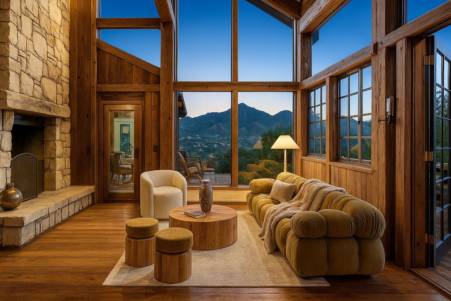
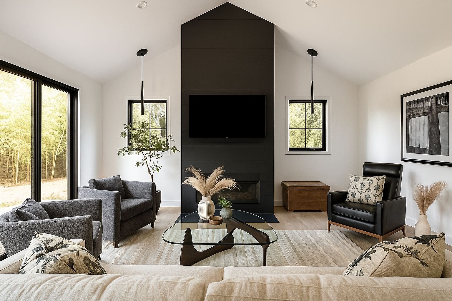
Make Use of Vertical Space: Look Up, Your Ceiling Misses You
Here’s a question for you: when was the last time you actually looked at your ceiling? Not just a casual glance when you’re lying in bed, but really looked at it? If you’re like most people, the answer is probably “never” or “when I was trying to find that weird noise.” We spend so much time thinking about floor space that we completely ignore the massive amount of real estate floating above our heads.
I learned this lesson the hard way when I was trying to fit all my books into my apartment. I had them stacked on the floor, piled on my coffee table, and basically everywhere except where they belonged. Then my friend walked in, looked around, and said, “Why don’t you just go up?” She pointed at my sad little bookshelf that barely reached my shoulder. “You’ve got like eight feet of wall space you’re not using.”
She was right. I’d been so focused on finding floor space for another bookshelf that I hadn’t considered just getting a taller one. The next weekend, I swapped my stumpy shelf for a floor-to-ceiling unit, and it was like someone had cast a spell on my living room. Not only did I have space for all my books, but the room suddenly looked twice as tall. My eyes were drawn upward instead of getting stuck at shoulder level, and the whole space felt more open.
This vertical thinking applies to way more than just bookshelves. Think about your storage needs. Instead of spreading everything out horizontally with multiple short pieces of furniture, go tall and slim. A narrow tower of drawers takes up way less visual and physical space than a wide, squat dresser. The same goes for cabinets, wardrobes, and even plant stands. When you build up instead of out, you’re working with your room’s natural dimensions instead of fighting against them.
But here’s where it gets really interesting. It’s not just about the furniture itself. It’s about where you put things on your walls. Most people hang artwork at eye level, which makes sense from a viewing perspective. But if you want your room to feel taller, you need to break that rule. Hang your pictures higher than feels natural. I’m talking several inches above where your instinct tells you to put them. When people walk into the room, their eyes will follow the art upward, and suddenly your ceiling seems further away than it actually is.
I tried this in my hallway, which is basically a narrow tunnel that connects my living room to my bedroom. I hung a series of small frames in a vertical line that went almost to the ceiling. People who visit always comment on how tall the ceiling looks, even though it’s a standard eight-footer. The frames create a visual ladder that tricks your brain into perceiving more height. It’s like an optical illusion, but one you get to live in.
The same trick works with curtains. If you hang your curtain rod right above the window frame, you’re essentially drawing a line that says, “This is where the wall ends.” But if you mount that rod as close to the ceiling as possible and let the curtains fall all the way to the floor, you’ve just added visual height to your entire room. The windows look bigger, the walls look taller, and you’ve done it all without knocking down a single wall or raising the roof.
Vertical stripes are another weapon in your arsenal. I’m not saying you should wallpaper your entire room in pinstripes like a 1920s mobster’s suit. But a subtle vertical pattern on one accent wall can work wonders. The lines pull your gaze upward, creating that same sense of height. You can do this with actual wallpaper, or get creative with paint and painter’s tape if you’re feeling handy.
Lighting plays into this too, which we’ll get into more later. But think about it: a tall floor lamp draws the eye up. A pendant light hanging from the ceiling creates a focal point above head level. Even the way you arrange your shelves matters. If you put your tallest items on the top shelves and work your way down, you’re creating a visual pyramid that emphasizes height.
I’ve got a friend who lives in a basement apartment with low ceilings. She was convinced there was nothing she could do about it until she started applying these vertical principles. She painted thin vertical lines in a slightly lighter shade than her wall color. She hung all her art in the upper third of her walls. She got tall, skinny plants instead of wide, bushy ones. The transformation was remarkable. The apartment still has low ceilings, but it doesn’t feel like a bunker anymore.
The beauty of using vertical space is that it costs you nothing in terms of floor area. You’re not sacrificing any of your precious walking room or furniture placement options. You’re just using the dimension that was sitting there all along, waiting for you to notice it. And when you do, it’s like finding extra square footage you didn’t know you had.
Lighting: Stop Relying on That One Sad Ceiling Light
Let’s talk about the biggest mistake people make with their lighting. You know what it is? That single overhead light fixture that’s been hanging in your living room since you moved in. The one you flick on when you walk in the door and leave on until you go to bed. The one that bathes your entire room in the same flat, uninspiring glow that makes everything look like a doctor’s waiting room.
I used to be guilty of this too. I’d come home, hit the switch by the door, and boom, instant light. It was convenient, sure, but it was also turning my apartment into a place that felt about as cozy as a parking garage. Overhead lighting is fine for seeing where you’re going, but it’s terrible for creating depth and dimension in a room. When every corner is lit exactly the same way, your brain reads the space as flat and small. There’s no mystery, no shadow, no sense of layers.
The fix is simple: you need multiple light sources at different heights and in different locations. Think of it like this. If you’re taking a photo of someone and you blast them with one harsh light from directly above, they look washed out and one-dimensional. But if you use multiple lights from different angles, suddenly there’s depth, warmth, and interest. Your room works the same way.
Start by getting some table lamps. I know, I know, it sounds basic. But hear me out. A good table lamp on an end table or a side table creates a pool of light that defines that area of the room. It makes that corner feel intentional and inviting. When you have several of these pools of light scattered around your space, your room suddenly has zones instead of just being one big blob. And zones make a room feel bigger because your brain interprets them as separate areas with different purposes.
I’ve got three lamps in my living room, and I almost never use the overhead light anymore. There’s one next to the couch for reading, one on a bookshelf that highlights my favorite books and creates a warm glow, and one on a side table near the window that I turn on in the evening. When they’re all on, the room feels about twice as big as it does with just the ceiling light. The shadows and variations in brightness create depth that tricks your eye into seeing more space.
Floor lamps are another game changer. They’re great if you don’t have room for a bunch of side tables (and let’s be real, who does?). A tall floor lamp in a corner can wash the wall with light, pushing the boundaries of the room outward. I’ve got an arc floor lamp that reaches over my couch, and it creates this perfect reading nook while making the ceiling feel higher. Two benefits in one piece of furniture.
Wall sconces are the move if you want to get a bit fancier. They free up surface space that would otherwise be occupied by lamps, and they add that vertical element we talked about earlier. I installed two sconces in my bedroom on either side of where my headboard would be if I had a headboard. They provide reading light without taking up space on my tiny nightstand, and they make the walls feel more finished and intentional.
Here’s something else I’ve learned about lighting: dimmers are your best friend. Being able to control the intensity of your light sources gives you power over the mood and perceived size of your room. Bright light makes everything visible and energetic, which is great for cleaning or getting ready in the morning. But lower light creates intimacy and makes spaces feel more expansive because the shadows soften the boundaries of the room.
I put my overhead light on a dimmer, and now I actually use it sometimes. When I have people over and need the whole room well-lit, I crank it up. But most evenings, I keep it low and rely more on my lamps. The room feels completely different depending on the lighting situation, and having that flexibility means I can adjust the feeling of spaciousness based on what I’m doing.
Another trick is to light up the corners. Dark corners make rooms feel smaller because they create these black holes that your eye reads as the edge of the space. But if you put a small lamp or even an uplighting fixture in a corner, you illuminate it and push that perceived edge outward. I’ve got a corner in my living room that used to just be dead space where I’d pile stuff I didn’t know what to do with. I put a tall plant there with a small spotlight shining up through the leaves, and now it’s a feature instead of a problem.
The type of bulb matters too. Warm white bulbs make spaces feel cozy but can make them feel smaller if you’re not careful. Cool white or daylight bulbs make spaces feel larger and more open, but they can also feel sterile if you go too bright. I mix them depending on the room and the purpose. My living room has warm bulbs because I want it to feel inviting. My kitchen has daylight bulbs because I want it to feel clean and spacious.
Think about accent lighting too. Got a piece of art you love? Light it up with a small picture light or a directed spot. Got a bookshelf? Put LED strips along the shelves. These little touches add layers to your lighting design, and layers equal depth, and depth equals the perception of more space. Your eye travels around the room finding these little points of interest instead of just taking in the whole space at once and deciding it’s small.
I used to think fancy lighting was only for people with big budgets and interior designers on speed dial. But you can get decent lamps at thrift stores, and basic dimmer switches cost about fifteen bucks at the hardware store. The difference it makes is so much bigger than the investment. When people come over now, they always comment on how spacious and comfortable my apartment feels, and I know it’s at least partially because I finally figured out how to light it properly.
Windows: Let the Sun Do Half the Work
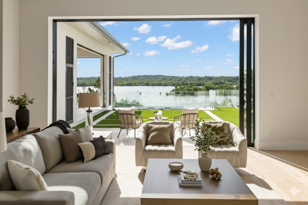
You know what the most expensive light fixture you own is? Your window. And unlike that fancy chandelier you’ve been eyeing online, this one doesn’t cost you a dime to operate. Natural light is hands down the most powerful tool you have for making a space feel bigger, and most of us are blocking it like we’re vampires afraid of disintegrating.
I realized this when I moved into an apartment with these massive windows that faced south. I was so excited about all that light. Then I immediately went out and bought heavy blackout curtains because, I don’t know, that’s what you’re supposed to do? Within a week, my bright, airy apartment felt like a cave. I was keeping the curtains closed during the day because they looked nice and formal, and I was living in this dim, cramped-feeling space with a perfectly good source of free light sitting right there.
The moment I swapped those heavy curtains for some light, sheer panels, everything changed. The room didn’t just get brighter. It got bigger. The natural light bounced off the walls and highlighted the corners. Shadows disappeared. The whole space felt alive in a way it hadn’t before. And here’s the kicker: the sheer curtains still gave me privacy. I could see out, but people couldn’t really see in, at least not clearly. I’d been making my space feel smaller for literally no reason.
If you can get away with no curtains at all, even better. I know that’s not always practical. Maybe you’re on a ground floor, or you’ve got neighbors who are a little too close for comfort, or you just like the aesthetic of having window treatments. I get it. But if privacy isn’t a concern, leaving your windows completely bare is like giving your room a direct line to the outdoors. The lack of visual interruption makes the window feel like an extension of your space rather than a barrier.
When you do need curtains, mount the rod as wide as possible. Don’t just hang it so it covers the window frame. Go several inches beyond on each side. When the curtains are open, they’ll stack completely off the glass, letting in maximum light. And when they’re closed, the window will look wider than it actually is. Same window, bigger visual impact, more light when you want it.
The color of your window treatments matters more than you’d think. Dark, heavy fabrics absorb light and create this visual weight that makes your windows feel smaller. Light colors reflect light and blend with the walls, making the whole area feel more open. I’ve got white linen curtains now, and they practically disappear during the day. The focus stays on the light and the view, not on the fabric.
Let me tell you about my kitchen window situation. It’s a small window over the sink, nothing special. I used to have a valance up there because the previous tenant had left one, and I just never took it down. That valance blocked about six inches of the window, which doesn’t sound like much until you realize that in a small kitchen, that six inches of natural light makes a real difference. I took it down one weekend when I was cleaning, and I never put it back up. The kitchen immediately felt less claustrophobic.
If you’ve got window sills, keep them clear. I know it’s tempting to line them up with plants or decorations or that collection of rocks your kid brought home from the beach. But every item on that sill is blocking light and making your window feel smaller. I put all my window sill plants on a shelf near the window instead. They still get light, but the window stays clear and functional.
Speaking of plants, if you’re going to have them near windows, choose ones that are tall and narrow rather than short and bushy. A tall plant on a stand next to a window draws the eye up and emphasizes the window’s height. A short, wide plant sitting on the sill blocks light and makes everything feel more crowded. Same goes for furniture placement. Don’t put your couch or a big piece of furniture right in front of a window. You’re blocking your light source and making the room feel more closed off.
Clean your windows. I know this sounds obvious, but seriously, when was the last time you washed your windows? Dirty glass can block up to 40% of natural light. I learned this when I finally got around to cleaning mine after about six months of putting it off. The difference was shocking. It was like someone had turned up the brightness dial on my apartment. My windows weren’t tinted after all; they were just gross.
If you’re lucky enough to have multiple windows, make sure you’re not blocking the sight lines between them. When you can see from one window to another, it creates a sense of flow and openness. If you’ve got a bookshelf or a wardrobe blocking that view, you’re cutting your room in half visually. I rearranged my furniture so that my main windows have a clear relationship with each other, and the difference in how the light moves through the space is remarkable.
Window film is a good compromise if you need privacy but don’t want to lose light. The frosted kind lets in tons of natural light while keeping nosy neighbors from watching your Netflix binges. I put some in my bathroom, which has a window that faces directly into my neighbor’s kitchen. Now I get all the light without the awkward eye contact.
Think about the view too, if you’ve got one. Even if it’s not spectacular, even if it’s just other buildings or a parking lot, that view extends your space visually. Your eye travels beyond your walls, and your brain interprets that as more room. Frame it, don’t hide it. If your view is actually bad, you can use those sheer curtains to soften it while still letting in light.
Here’s something I didn’t know until recently: the angle of natural light changes throughout the day and throughout the year. In winter, the sun is lower and the light is warmer. In summer, it’s higher and cooler. If you pay attention to how the light moves through your space, you can arrange your furniture and activities to take advantage of it. I moved my desk to catch the morning light, and now I wake up easier and feel more energized while I’m working.
Natural light doesn’t just make your space look bigger. It makes it feel better. There’s actual science behind this. Exposure to natural light improves your mood, helps you sleep better, and even boosts your productivity. So by maximizing your windows, you’re not just creating the illusion of space. You’re creating a healthier, happier environment. And that’s worth way more than a few extra square feet.
Mirrors: The Closest Thing to Actual Magic
Let me tell you about the mirror that changed my life. Okay, that sounds dramatic, but stay with me. I bought this full-length mirror at a thrift store for twelve dollars. It was in a cheap frame, nothing special, and I just needed something to check my outfit before leaving the house. I propped it up against the wall across from my window while I figured out where to hang it, and then I left it there for about a week because I’m lazy.
During that week, three different people came over and commented on how much bigger my bedroom looked. I thought they were nuts. Nothing had changed except for this mirror leaning against the wall. But then I really looked at it, and I got it. The mirror was reflecting the window, effectively doubling the amount of natural light in the room. It was creating the illusion that there was another window where the mirror was. My brain was being tricked into thinking the room extended further than it actually did.
That’s when I fell down the rabbit hole of strategic mirror placement. Mirrors are like the Swiss Army knife of interior design. They reflect light, they create the illusion of depth, they can make a room look twice as big, and they’re way cheaper than knocking down walls. But here’s the thing: they only work if you use them right. Stick a mirror in the wrong spot, and it’s just going to reflect your mess back at you, doubling your clutter instead of your space.
The golden rule of mirror placement is this: put them where they’ll reflect something worth looking at. A mirror across from a window is perfect because it bounces that natural light all over the room. A mirror that reflects a nice piece of art or an interesting architectural feature creates depth and makes your room feel more layered. A mirror that reflects a pile of dirty laundry or your overflowing trash can? Not so much.
I learned this the hard way when I hung a mirror in my entryway. I thought I was being smart, putting it right by the door so I could check myself on the way out. The problem was that it reflected directly into my living room, which is where I tend to leave my work bag, my shoes, and whatever else I dump when I walk in the door. So every time I looked in the mirror, I saw twice as much clutter. I moved it six inches to the left, and now it reflects the hallway and a piece of art instead. Much better.
Size matters with mirrors. A bunch of small mirrors scattered around won’t have the same impact as one large mirror. You want something substantial enough to create a real sense of expansion. I’ve got a mirror in my living room that’s about four feet tall and three feet wide, and it makes that wall look like there’s another room behind it. When people first come over, some of them actually think there’s a doorway there until they get closer.
The shape of your mirror affects the vibe too. Rectangular mirrors tend to feel more formal and can emphasize either height or width depending on how you hang them. Round mirrors soften a space and work well in rooms with lots of straight lines and angles. I’ve got a round mirror in my bathroom, and it balances out all the sharp corners and tile edges. It makes the room feel less boxy.
Where you hang mirrors can emphasize different aspects of your space. A mirror on a narrow wall at the end of a hallway makes the hallway look longer. A mirror on the long wall of a narrow room makes it feel wider. I’ve got a skinny galley kitchen, and I hung a mirror on the long wall near the entrance. Now it looks like the kitchen extends further than it does. It’s a trick, sure, but it’s a good one.
Mirrors can also help with dark spaces. I’ve got this corner in my apartment where the light just never quite reaches. It’s not dark enough to be a problem, but it’s dim enough to feel a bit dead. I put a mirror there angled toward the window, and now that corner is one of the brightest spots in my place. The mirror catches the light and throws it exactly where I need it.
One thing to watch out for: don’t put mirrors directly across from each other. I tried this in my bathroom thinking it would create an infinite reflection effect that would make the space feel huge. Instead, it just felt weird and disorienting. It’s like standing between two mirrors at a clothing store. Cool for about five seconds, then it just makes you dizzy. The infinite reflection thing sounds good in theory but doesn’t work in practice.
Mirrored furniture can be effective too, though you’ve got to be careful not to overdo it. A mirrored console table or cabinet can add light and space without dominating the room. I’ve seen whole mirrored walls in some places, and while they definitely make the space look bigger, they can also make it feel cold and impersonal. A little mirror goes a long way.
The frame of your mirror is part of the equation too. A heavy, ornate frame draws attention to the mirror itself, which can be nice if it’s a statement piece, but it doesn’t create as much illusion of space. A thin frame or a frameless mirror tends to blend more with the wall, making the reflection the focus. My big living room mirror has a simple thin black frame, and people usually notice the reflection before they notice the mirror.
You can use mirrors to fix awkward spaces too. I had this weird alcove in my bedroom that was too small for furniture but too big to ignore. I hung a mirror there, and now it looks intentional instead of like a builder’s mistake. The mirror reflects the rest of the room, visually connecting that alcove to the larger space.
Maintenance is something nobody tells you about. Mirrors need to be cleaned regularly, or they lose their effectiveness. A smudgy mirror doesn’t reflect light well, and it definitely doesn’t create the illusion of space. I keep glass cleaner in my bathroom and give my mirrors a quick wipe every few days. Takes about thirty seconds and makes a real difference.
Here’s my controversial take: bathroom mirrors should be as big as possible. I’m talking wall-to-wall, ceiling to counter. Not only does it make your morning routine easier (you can see your whole outfit, check your hair from different angles), but it makes what’s usually the smallest room in your home feel way more spacious. I did this in my bathroom, and guests always comment on how big it feels, even though it’s barely big enough to turn around in.
The psychology of mirrors is interesting too. They don’t just make a space look bigger; they make it feel bigger. When you can see yourself in a space, you become more aware of your movement through it. The reflection creates a sense of activity and life that makes the room feel more dynamic and less confined. It’s like having a companion in the room with you, except that companion is you, which sounds weird when I say it out loud but makes sense when you experience it.
Open Up Doorways: When Walls Become Suggestions
The first time I seriously thought about doorways was when I was helping my sister renovate her house. She had this classic 1950s layout where every room was its own little box. Kitchen separate from the dining room, dining room separate from the living room, everything divided and compartmentalized like a honeycomb. Each room was a decent size on its own, but the house felt small and choppy. You’d walk from room to room and feel like you were moving through a series of closets.
Then the contractor suggested removing a couple of walls to create an open floor plan. My sister was skeptical because she liked having defined spaces. But once those walls came down and the rooms flowed into each other, it was like someone had doubled the square footage. The same amount of space suddenly felt massive. You could stand in the kitchen and see all the way through to the living room. The light from the living room windows reached into the kitchen. The whole first floor became one interconnected space instead of a series of disconnected boxes.
Now, I know what you’re thinking. Most of us can’t just start knocking down walls. We’re renters, or we don’t have the budget, or we actually need those walls for privacy or storage. I get it. I live in a rental where I can’t even paint without permission. But there are ways to get some of that open-concept magic without a sledgehammer and a construction crew.
The easiest change is just removing doors. I know this sounds too simple to make a difference, but trust me on this one. Doors are psychological barriers as much as physical ones. Even when they’re open, they create a frame that your brain interprets as a boundary. Remove that frame, and the spaces start to blend together. I took the door off my bedroom closet, and my bedroom immediately felt larger. The closet became part of the room instead of a separate space hiding behind a door.
I did the same thing with my bathroom door for about a week, and the apartment felt twice as big. Then I realized that having no bathroom door is great for spatial perception but terrible for having roommates or guests, so I put it back. But the point stands: doorways without doors create flow and openness that you can’t get any other way.
If you need doors for privacy but want that open feeling, pocket doors are the move. They slide into the wall instead of swinging into the room, which means they don’t take up any space when they’re open. When I was looking at apartments, I saw one with pocket doors between the bedroom and living room, and it was genius. During the day, the doors disappeared into the walls, and the whole apartment flowed together. At night, you could close them for privacy. Best of both worlds.
French doors or glass-paned doors are another option. They maintain the privacy and sound barrier of a solid door while allowing light to pass through. My friend has French doors between her kitchen and dining room, and even when they’re closed, the spaces feel connected. You get the light, you get the visual flow, but you can still close off the kitchen when it’s a mess after cooking.
Widening doorways is a bigger project but can be done if you own your place. Standard doorways are about 30 to 36 inches wide. Bump that up to 42 or 48 inches, and you’ve created a more dramatic opening that makes adjacent rooms feel like parts of the same space. My parents did this between their living room and dining room, and the change was remarkable. The two rooms still felt distinct, but they also felt connected in a way they hadn’t before.
Archways instead of squared-off doorways add a sense of elegance and flow. They soften the transition between rooms and create a more gradual boundary. This is more of a renovation thing than a quick fix, but if you’re planning any work on your space, consider swapping some standard doorways for arches. I’ve seen this done in older homes, and it always makes the space feel more cohesive and less chopped up.
The trim around your doorways makes a difference too. Thick, dark trim creates a strong visual boundary. Thin trim in a color that matches your walls makes the doorway less prominent. I painted my doorway trim the same color as my walls, and those doorways kind of disappeared. The focus shifted to the spaces themselves rather than the boundaries between them.
If you can’t remove doors or widen openings, you can at least keep doors open as much as possible. I know this sounds obvious, but think about how often you close doors out of habit rather than necessity. I used to close my bedroom door every morning when I left for work. Why? No reason. I lived alone. Nobody was going in there. I was just in the habit of closing it. Once I broke that habit and left it open, my apartment felt less divided and more unified.
Think about the sight lines you create with open doorways. From my couch, I can now see through my bedroom doorway into my bathroom, where there’s a window. That visual connection to that far window makes my apartment feel deeper and more spacious than it is. I’m getting the benefit of that natural light and that sense of extended space without actually having more square footage.
Open doorways improve airflow too, which isn’t directly related to perceived space but contributes to the overall feeling of openness. When air can circulate freely through your home, it feels less stuffy and confined. I noticed this especially in the summer. With all my interior doors open, a breeze can travel from my front windows all the way through to my back windows. The place feels airy and light instead of closed off and stagnant.
The concept of open doorways extends to furniture placement too. Don’t block your doorways or the areas around them. I used to have a bookshelf right next to my bedroom door, and it made the doorway feel like a tunnel. I moved the bookshelf to a different wall, and suddenly that whole area opened up. The transition from living room to bedroom felt smoother and more natural.
One caution about open floor plans and open doorways: you lose some sound privacy. This is fine if you live alone or with people you don’t mind hearing all the time. But if you work from home and share space with others, or if you’re a light sleeper who needs quiet, you’ll need to balance the desire for openness with the need for acoustic separation. I work from home, and I’ve found that even with open doorways, I can create enough separation by using rugs and soft furnishings that absorb sound.
The cultural aspect of open spaces is interesting too. In some cultures, divided spaces are preferred for privacy and propriety. In others, open layouts are seen as more family-oriented and communal. There’s no right answer, just what works for your lifestyle and preferences. I grew up in a house with lots of doors and separated rooms, so my current open layout felt weird at first. Now I can’t imagine going back. The openness feels normal, and closed-off spaces feel claustrophobic.
If you’re trying to sell or rent your place, open doorways can be a real asset. People shopping for homes are drawn to open floor plans and spaces that flow together. Even if you can’t do major renovations, simple changes like removing unnecessary doors or keeping spaces visually connected can make your home more appealing to buyers or renters. It photographs better too. Real estate photos of open spaces always look more impressive than photos of small, closed-off rooms.
Light Walls: The Paint Job That Pays for Itself
Let me take you back to my first apartment after college. I was so excited to finally have my own place that I went a little crazy with paint. I painted my bedroom a deep, rich purple because I thought it looked sophisticated and moody. My living room was a bold red because I’d read somewhere that red stimulates conversation and energy. And my bathroom was navy blue because, honestly, I don’t remember my reasoning on that one.
The result? I was living in a cave. A colorful, well-intentioned cave, but a cave nonetheless. Each room felt like it was closing in on me. The purple bedroom was so dark that I needed to turn on lights even in the middle of the day. The red living room was intense in a way that made me feel anxious rather than energized. And the navy bathroom felt like a submarine. I’d made every room in my apartment feel about half the size it actually was, all with a few gallons of paint.
The fix was simple but labor-intensive: I repainted everything in light, neutral colors. Off-white walls, soft gray in the bedroom, barely-there beige in the bathroom. I’ll be honest,

Leave a Comment